The Brief
Through research, identify and communicate issues, memories, historical contexts or future visions specific to a chosen site. From here, create and deploy a graphic narrative expressed through words, images, etc and consider how to apply it into the place/space in which you have positioned your project. Consider implementations of trail markers and signage.
The Concept
The Forsaken Woodlands combines my passion for fiction and storytelling with design. Inspired by the Badu Mangroves' site history, The Forsaken Woodlands is a creative interpretation of the brief, culminating in a multisensory proposal for a night horror-themed trail walk spanning the pre-existing board walk at the site. Tackling issues of mankind's greed, ignorance and the unjust nature of capitalism through mediums such as creative writing and narration, animation, photographic manipulation, mark making, AR, etc, it urges visitors to rethink their apathetic attitudes towards the natural environment.
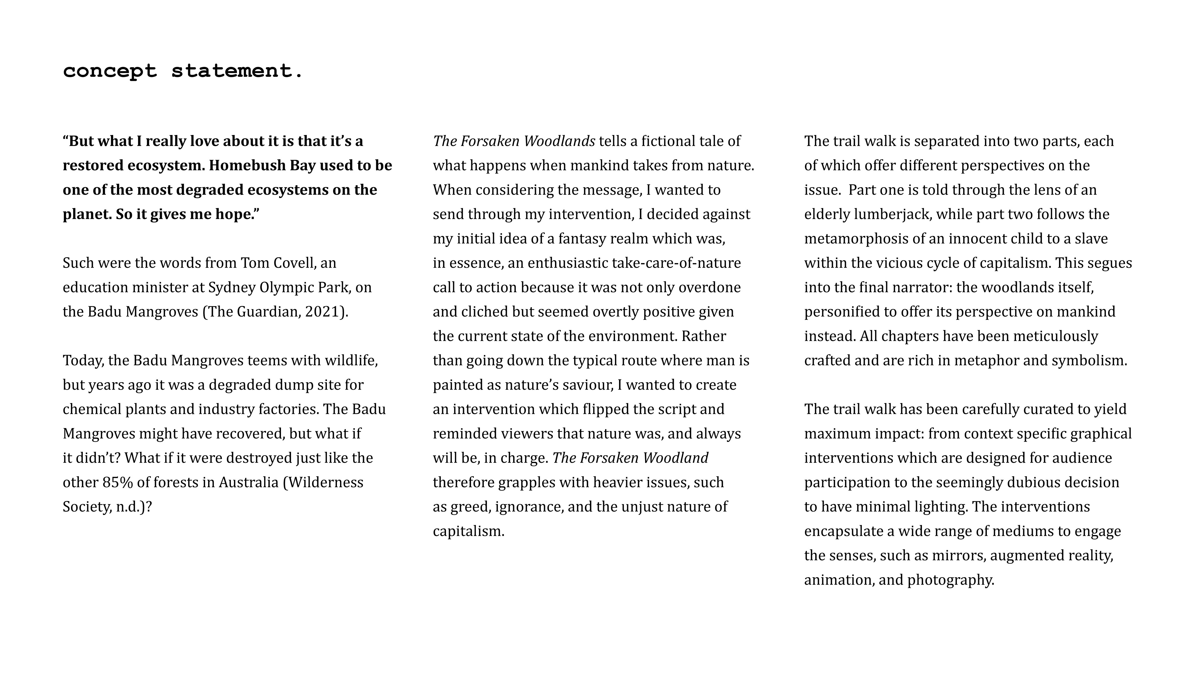
“But what I really love about it is that it’s a restored ecosystem. Homebush Bay used to be one of the most degraded ecosystems on the planet. So it gives me hope.”
Such were the words from Tom Covell, an education minister at Sydney Olympic Park, on the Badu Mangroves (The Guardian, 2021).
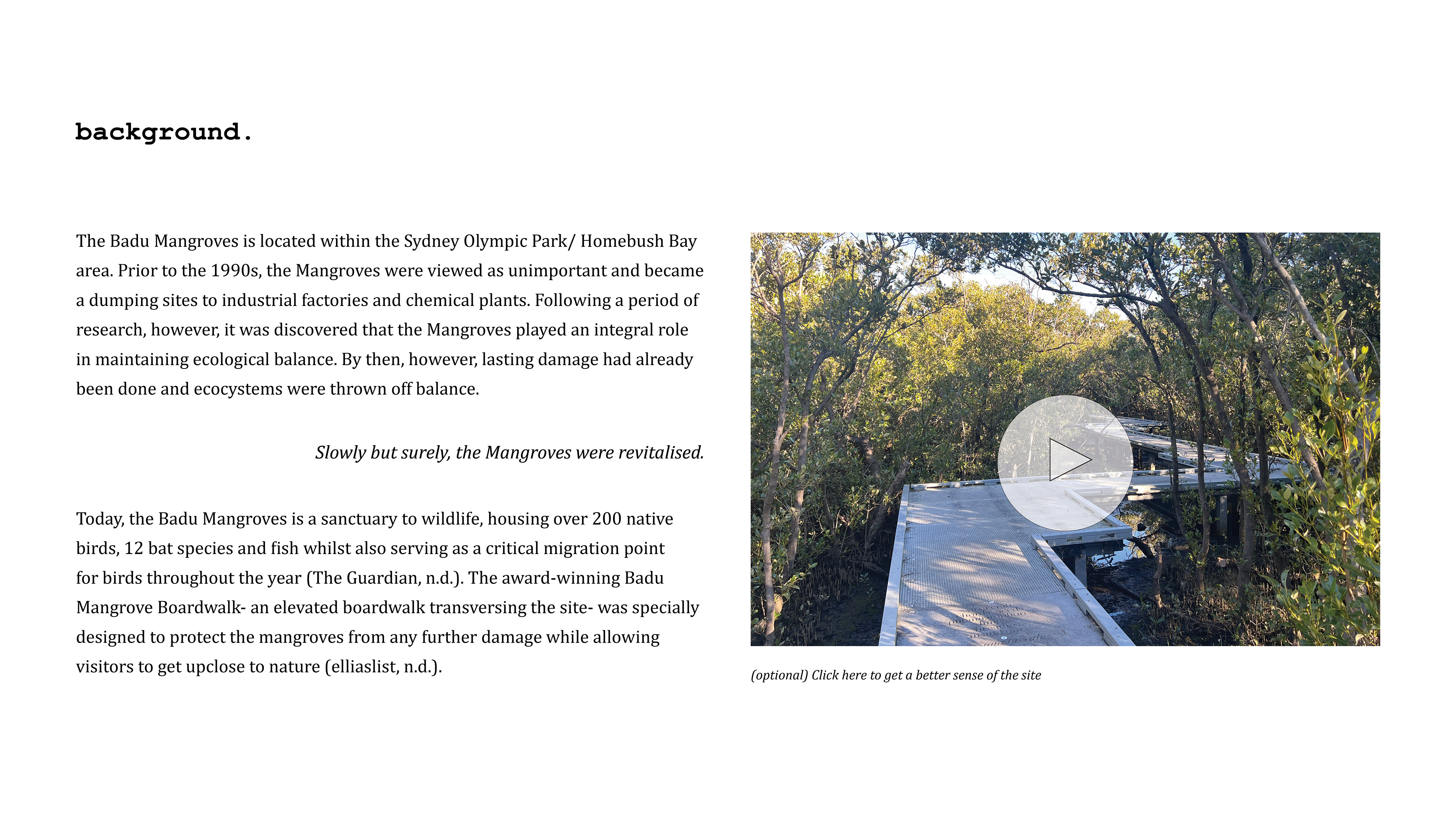
Today, the Badu Mangroves teems with wildlife, but years ago it was a degraded dump site for chemical plants and industry factories. The Badu Mangroves might have recovered, but what if it didn’t? What if it were destroyed just like the other 85% of forests in Australia (Wilderness Society, n.d.)?
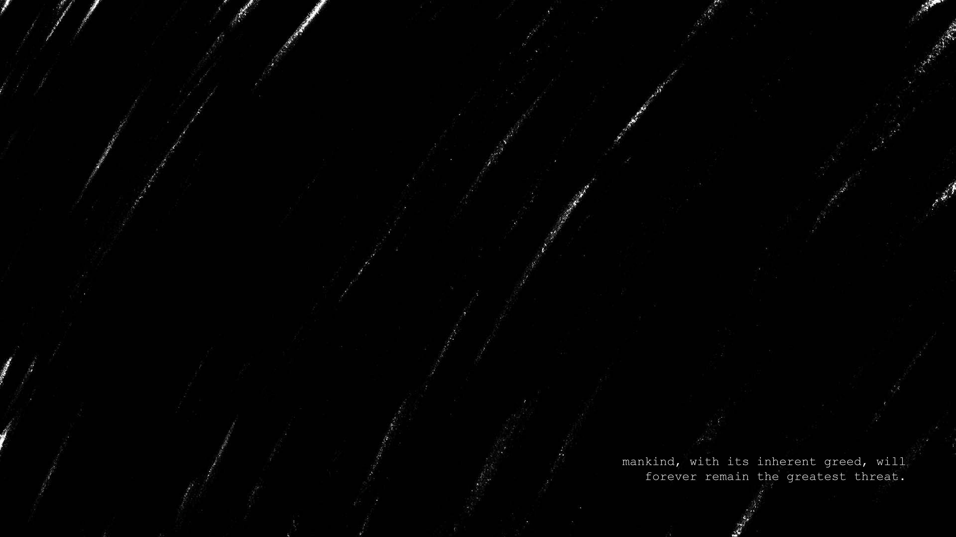
The Forsaken Woodlands tells a fictional tale of what happens when mankind takes from nature. When considering the message, I wanted to send through my intervention, I decided against my initial idea of a fantasy realm which was, in essence, an enthusiastic take-care-of-nature call to action because it was not only overdone and cliched but seemed overtly positive given the current state of the environment. Rather than going down the typical route where man is painted as nature’s saviour, I wanted to create an intervention which flipped the script and reminded viewers that nature was, and always will be, in charge. The Forsaken Woodlands therefore grapples with heavier issues, such as greed, ignorance, and the unjust nature of capitalism.
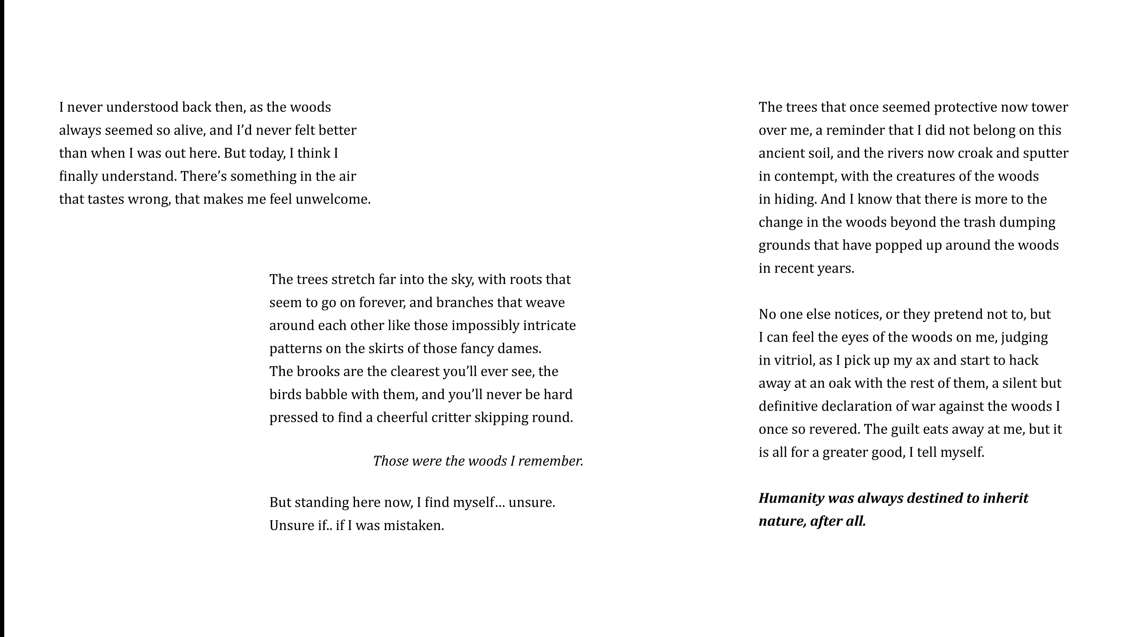
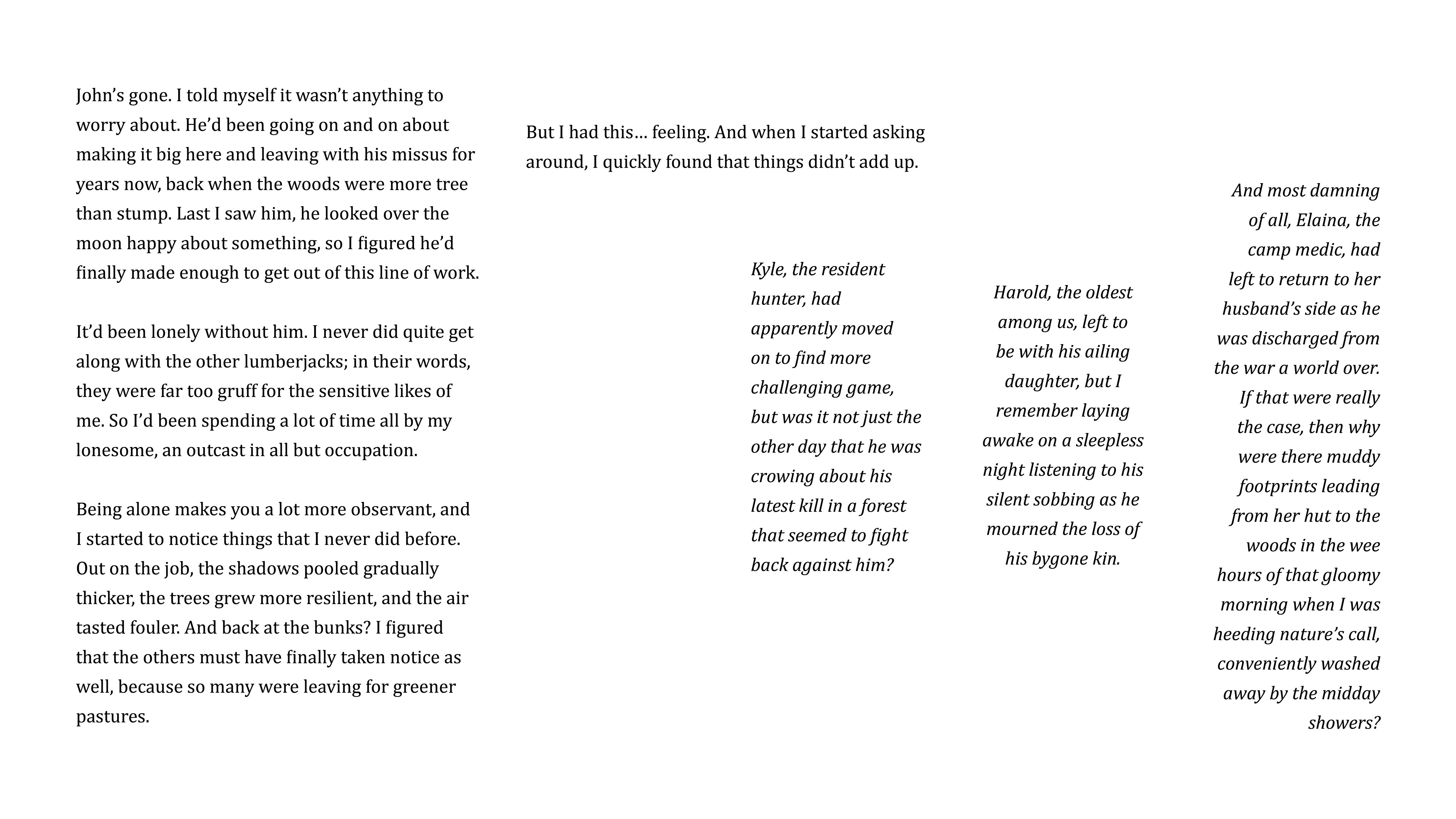
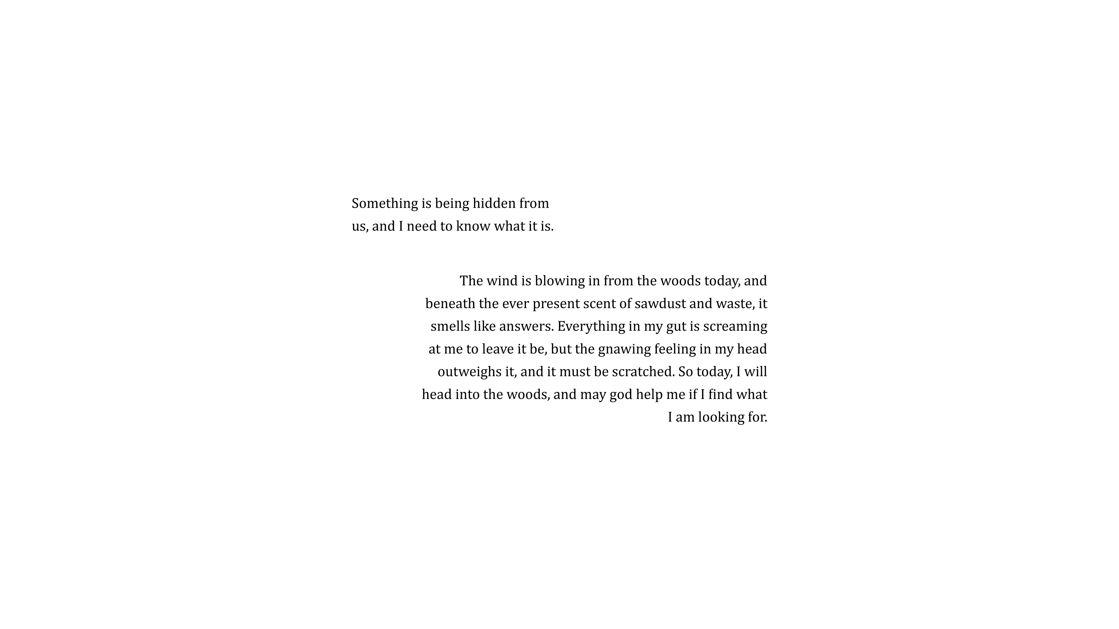
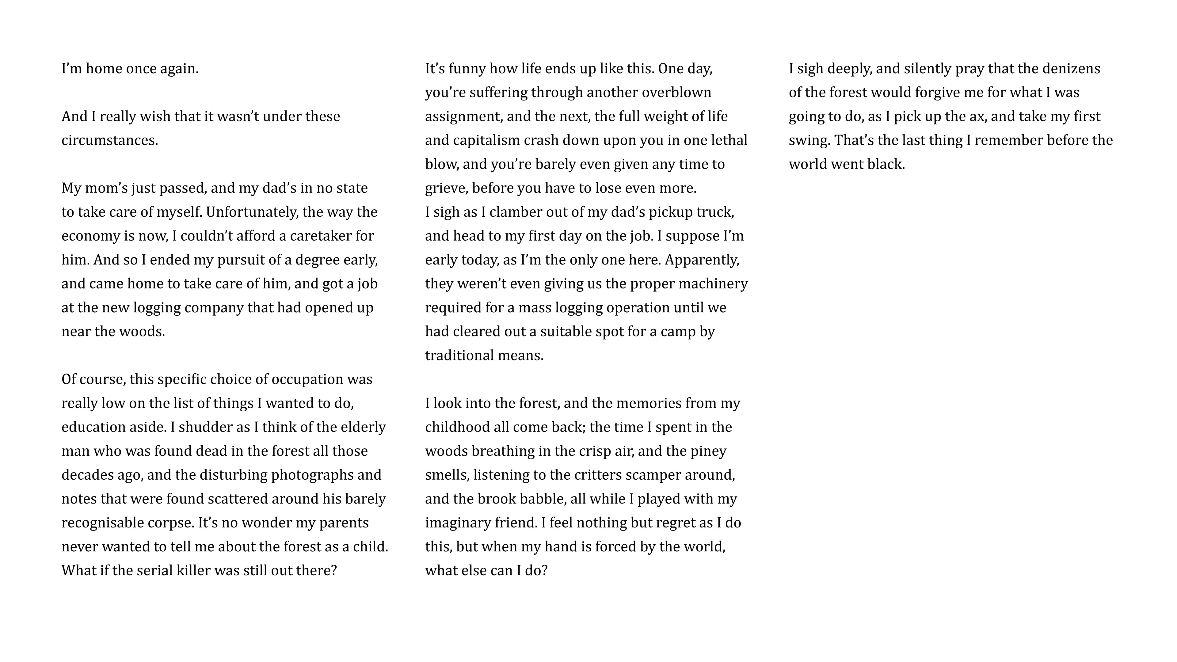
The trail walk is separated into two parts, each of which offer different perspectives on the issue. Part one is told through the lens of an elderly lumberjack, while part two follows the metamorphosis of an innocent child to a slave within the vicious cycle of capitalism. This segues into the final narrator: the woodlands itself, personified to offer its perspective on mankind instead. All chapters have been meticulously crafted and are rich in metaphor and symbolism.
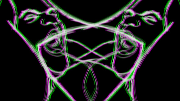
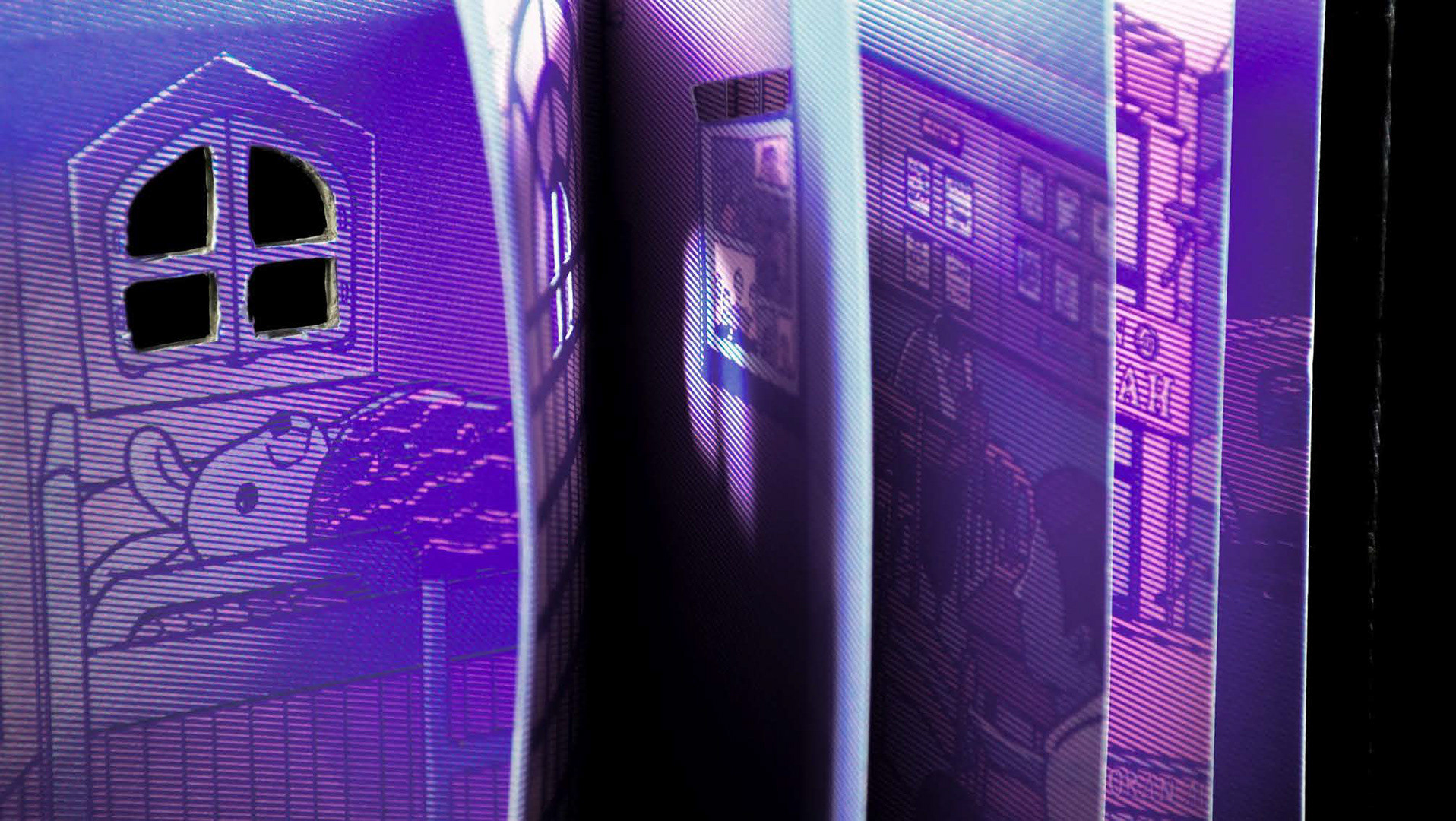
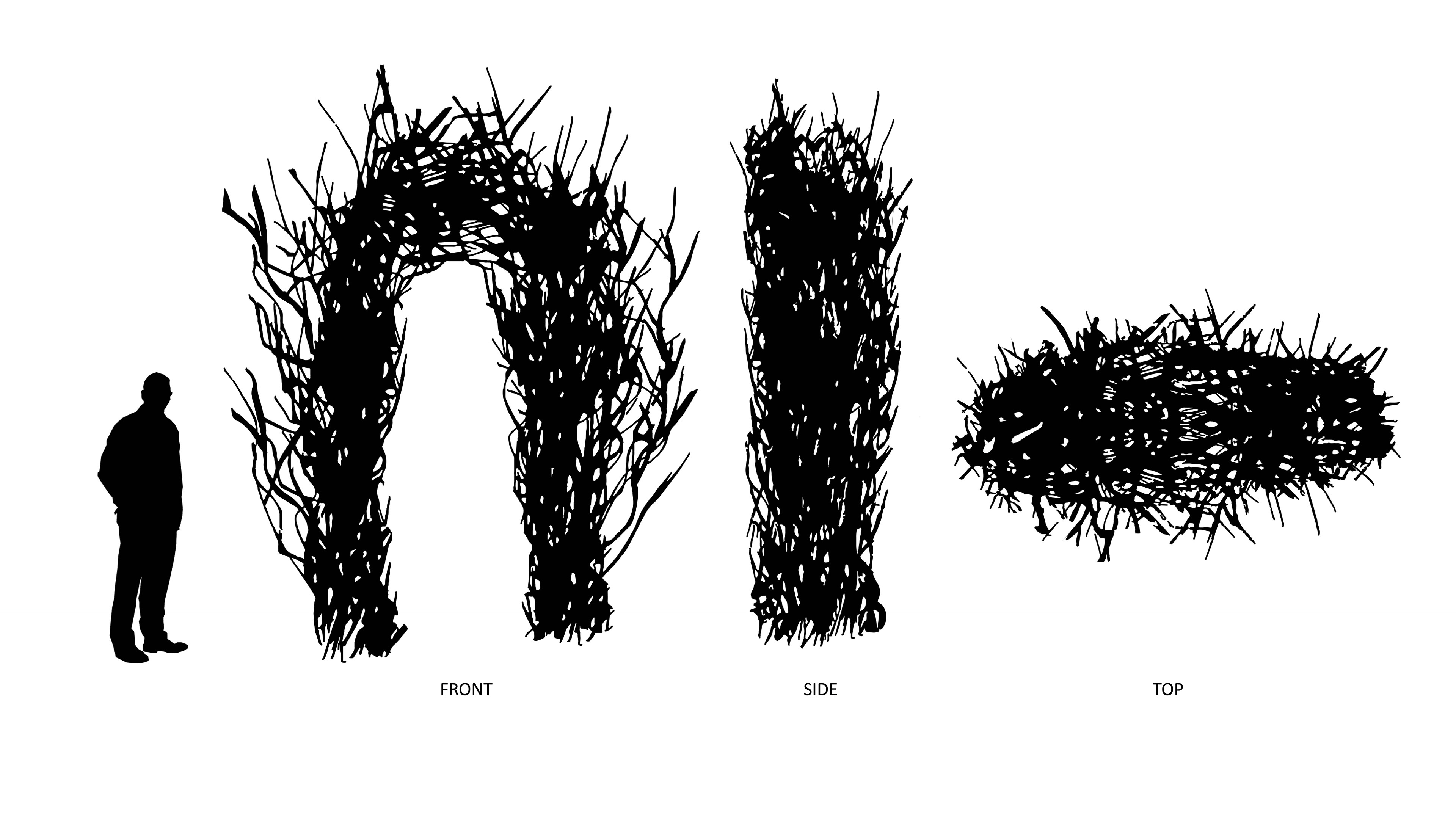
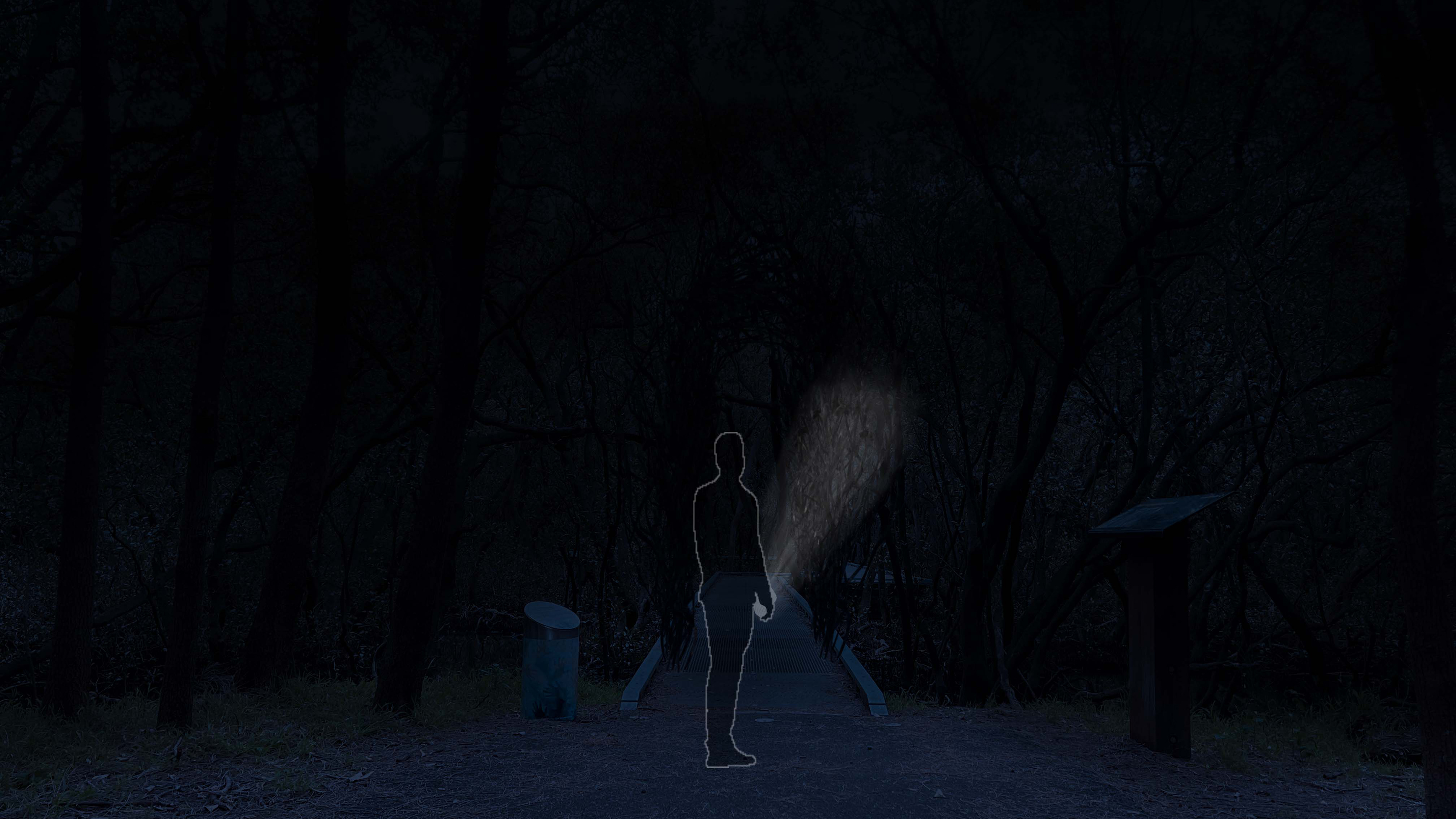
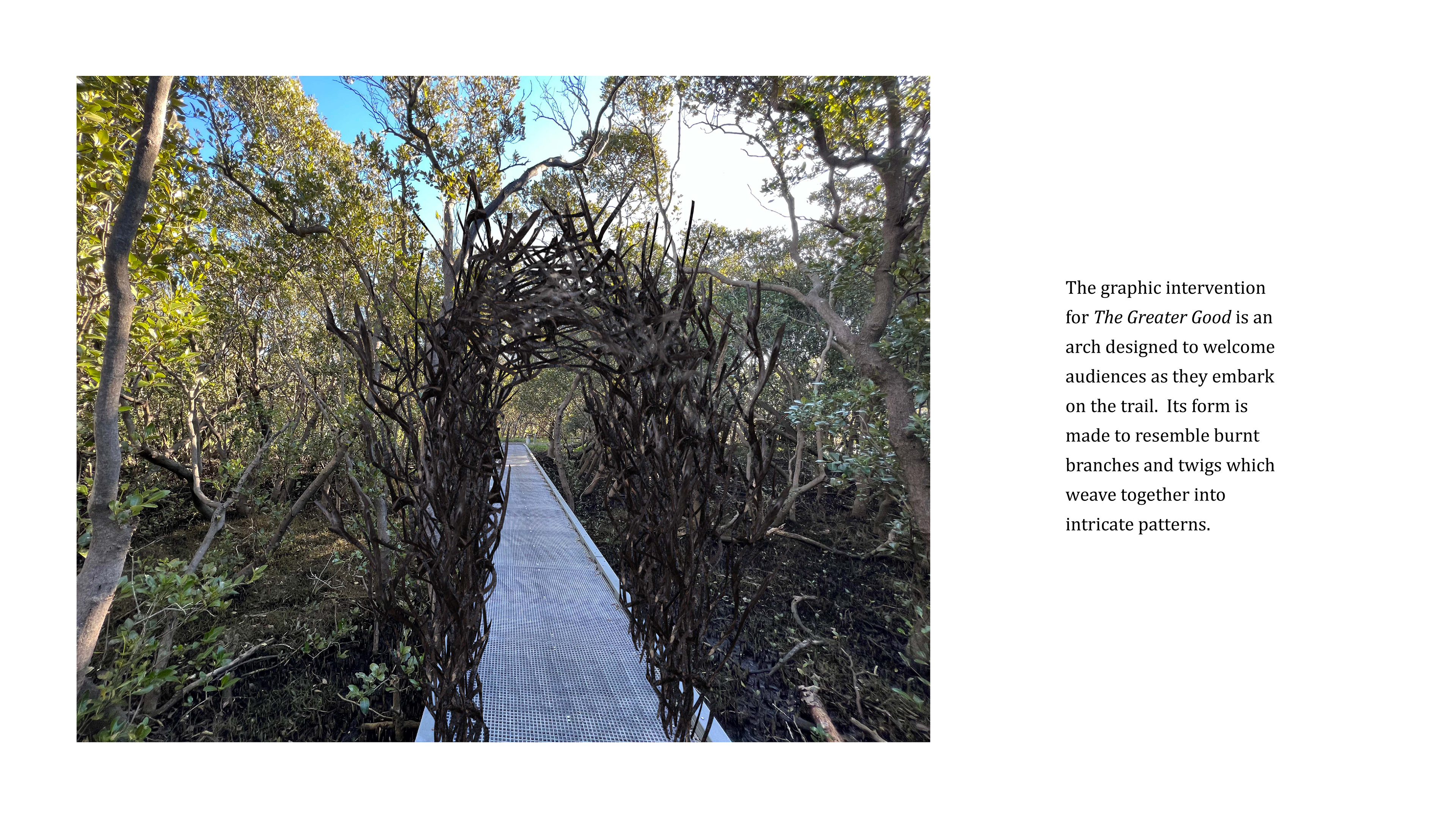
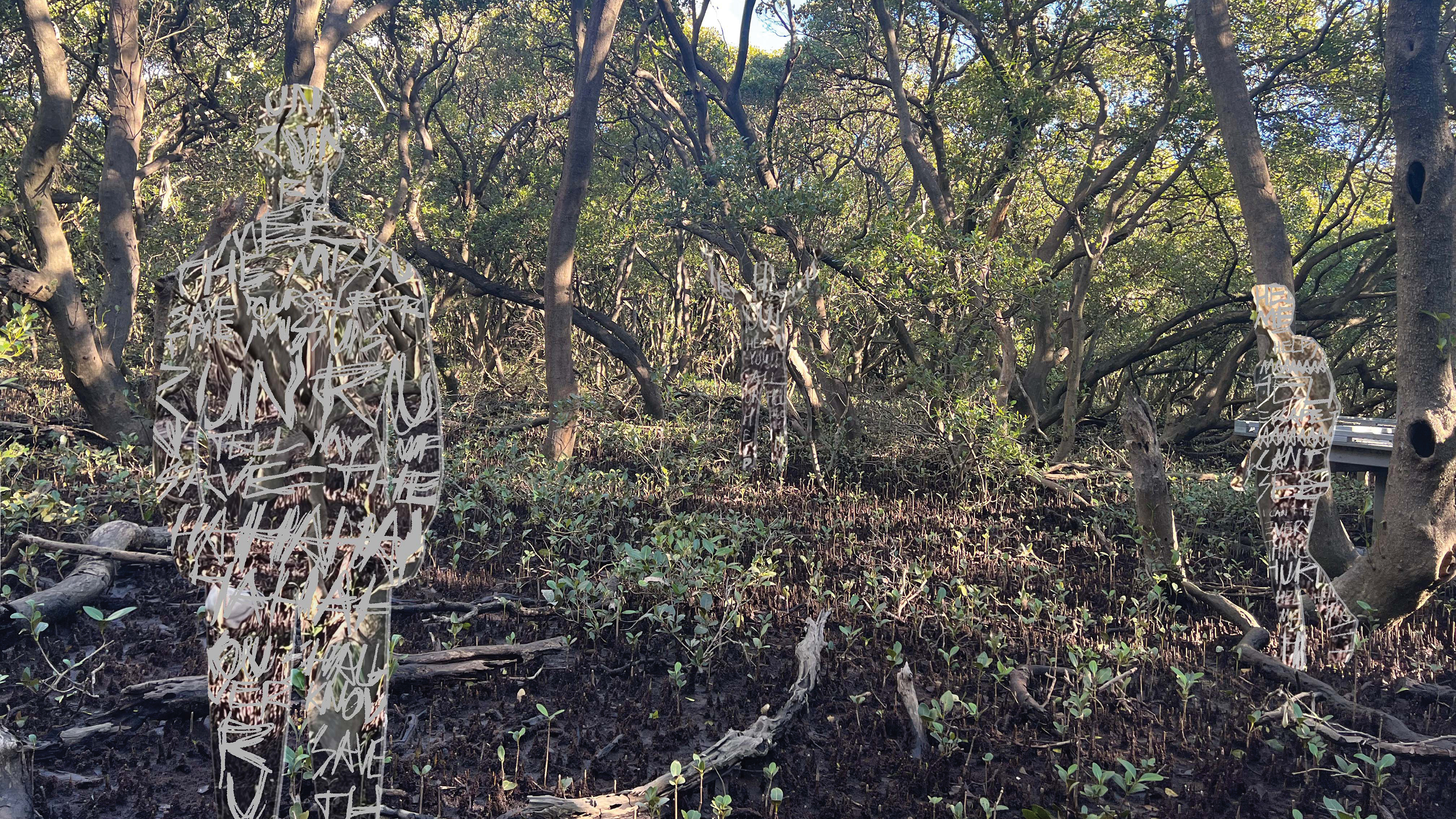
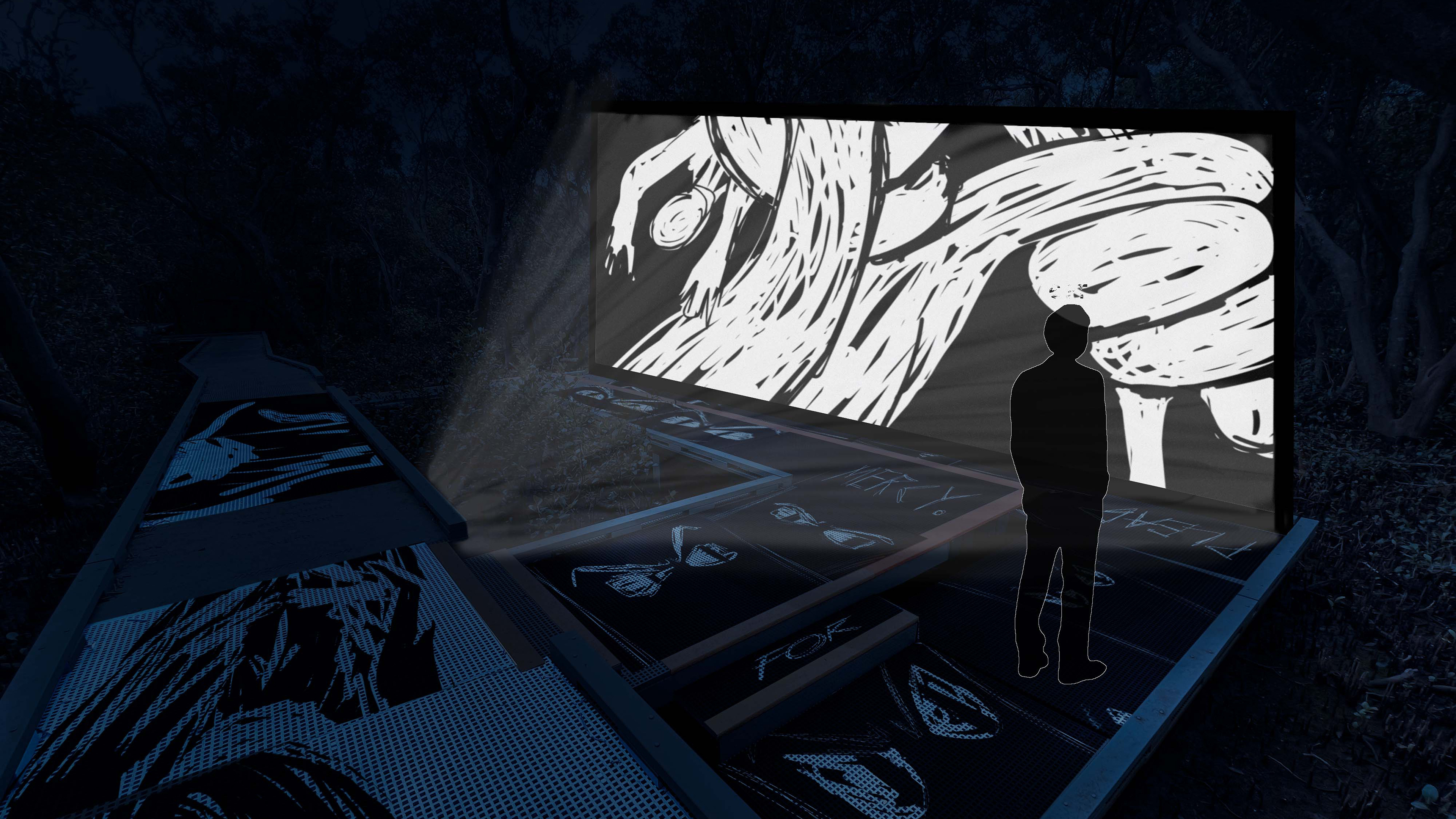
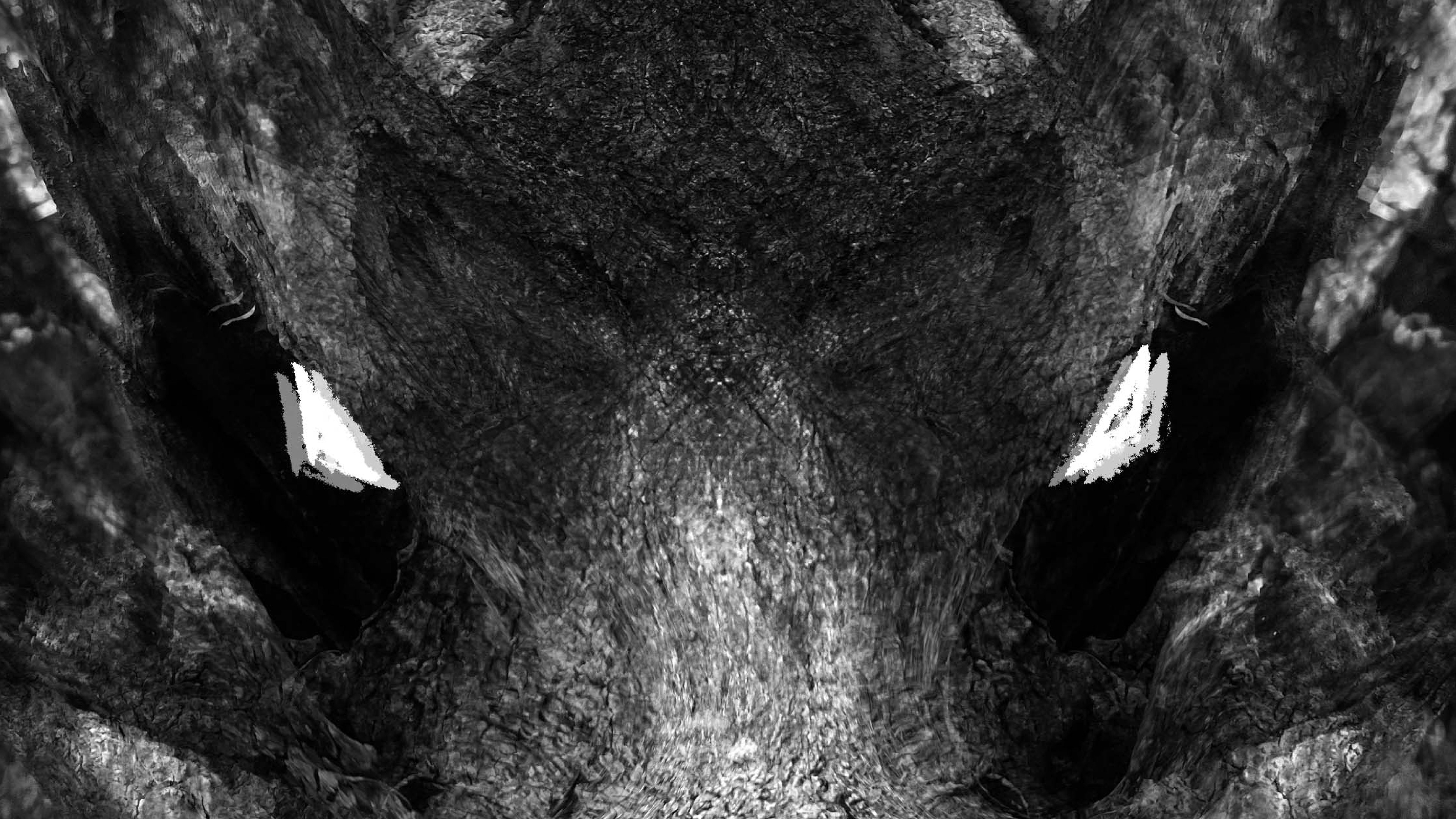
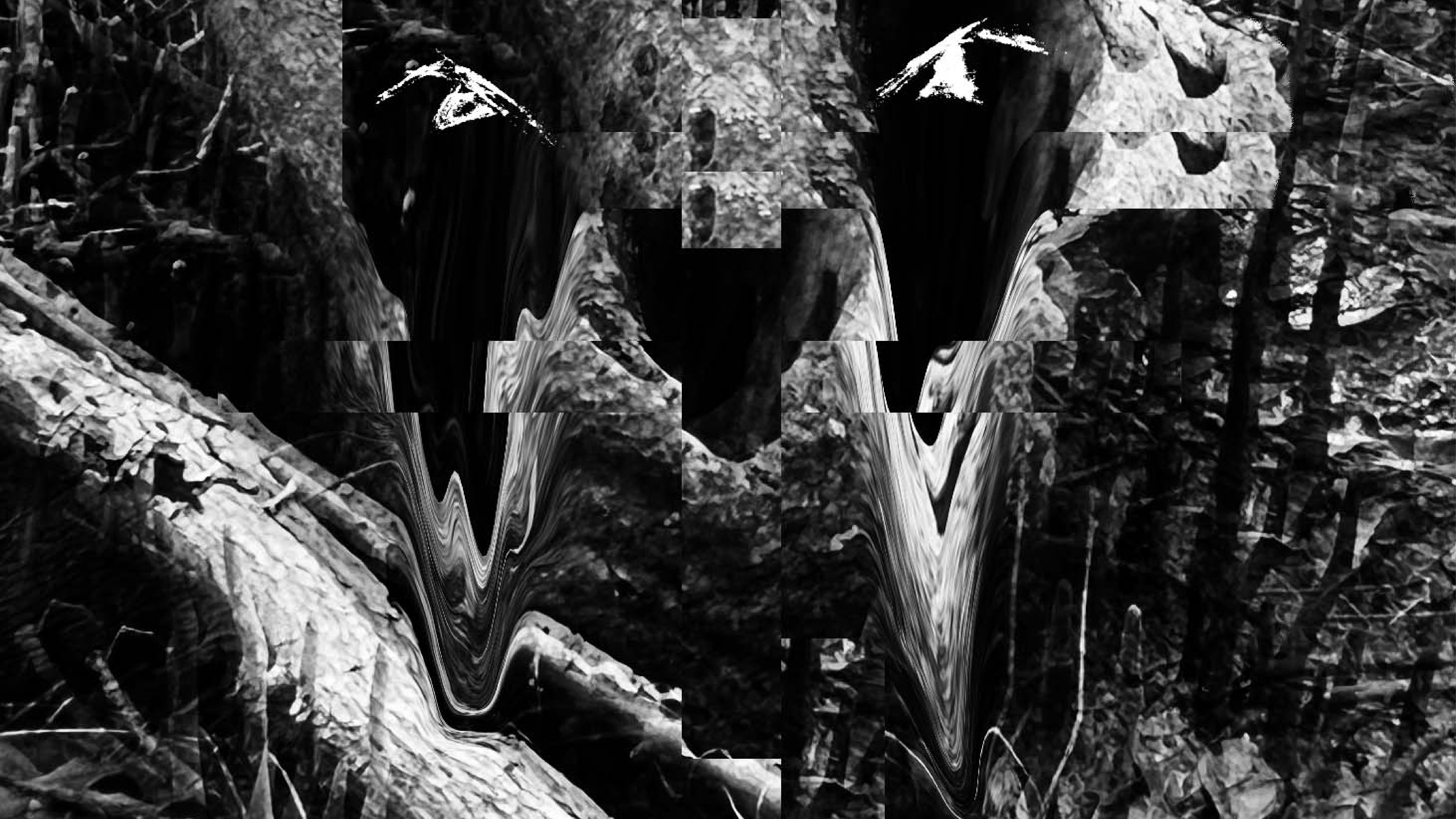
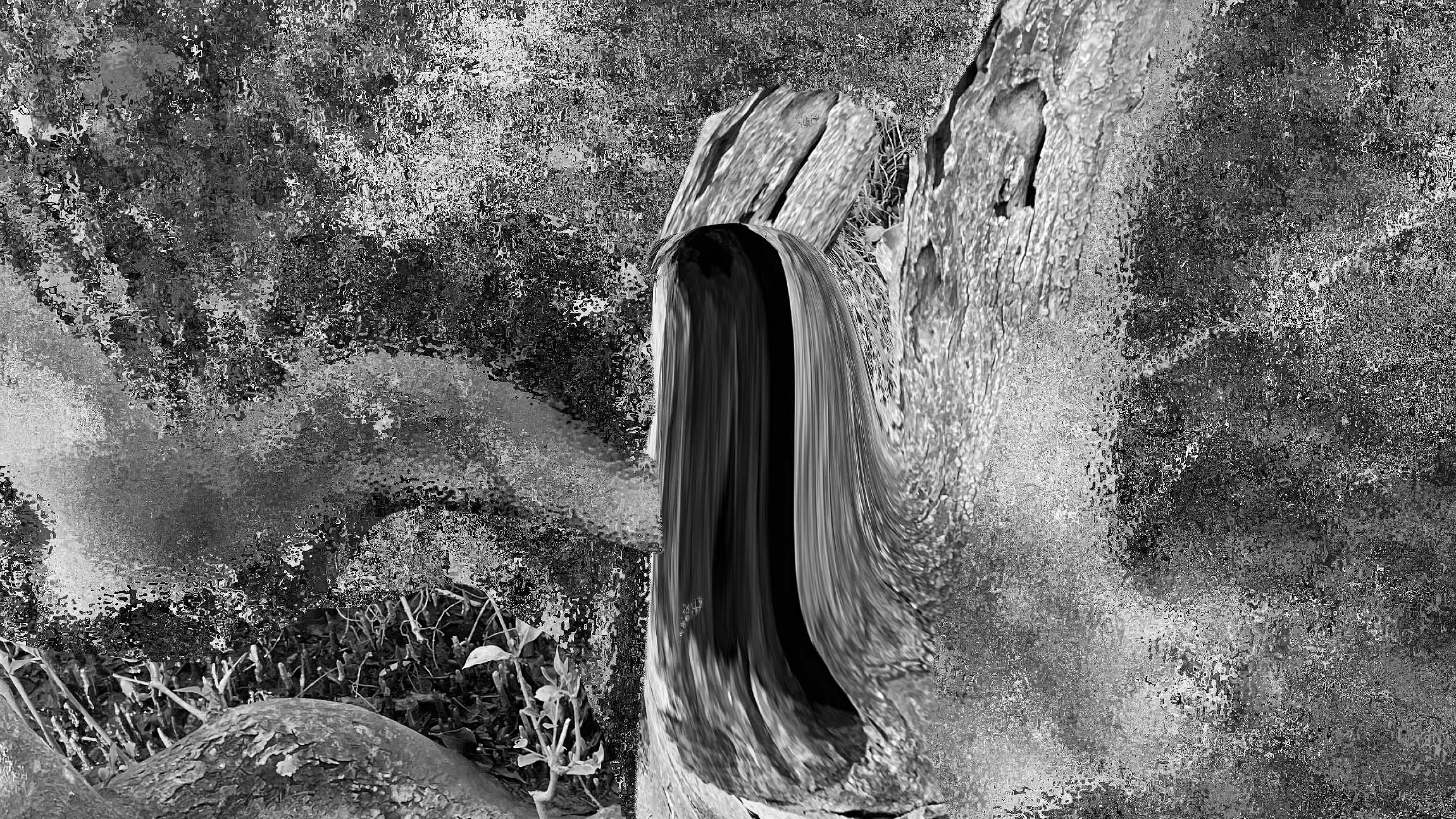
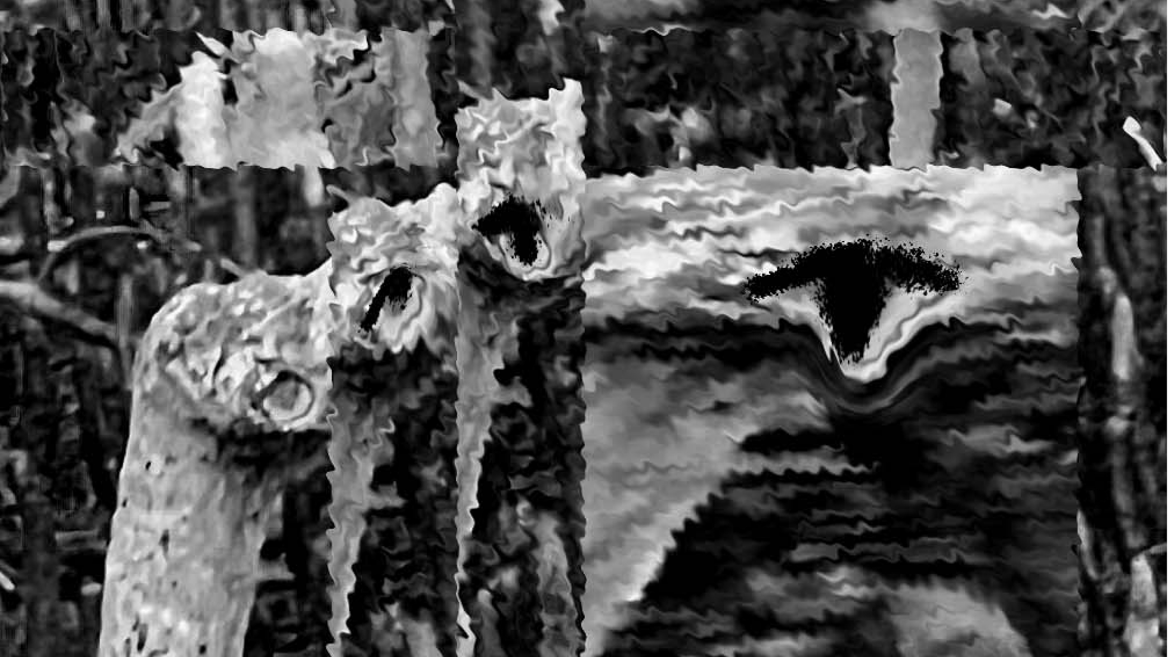
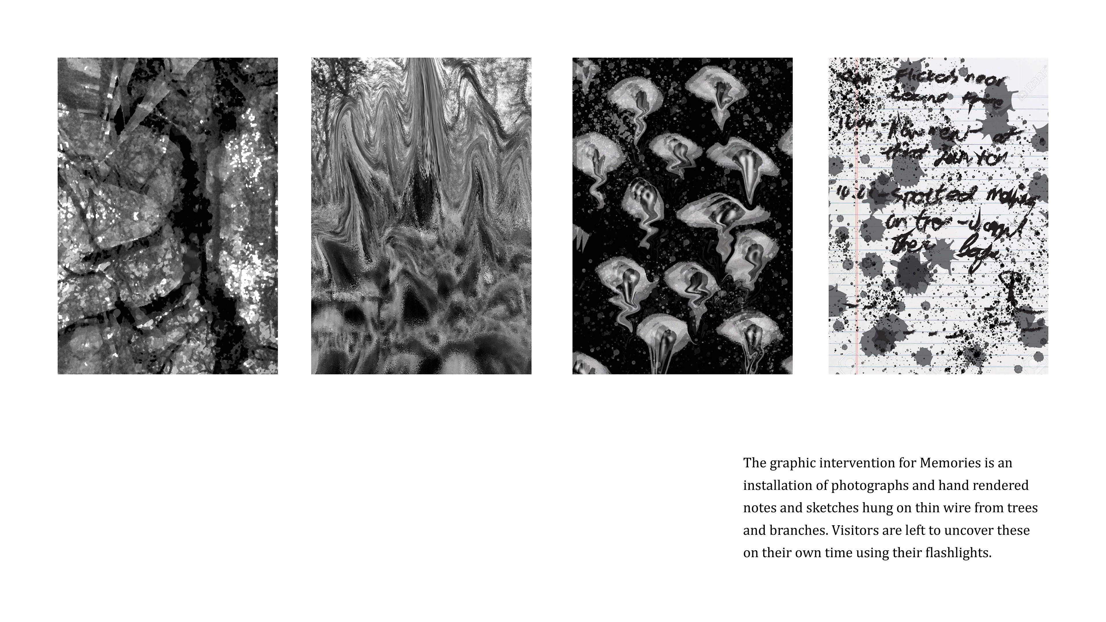
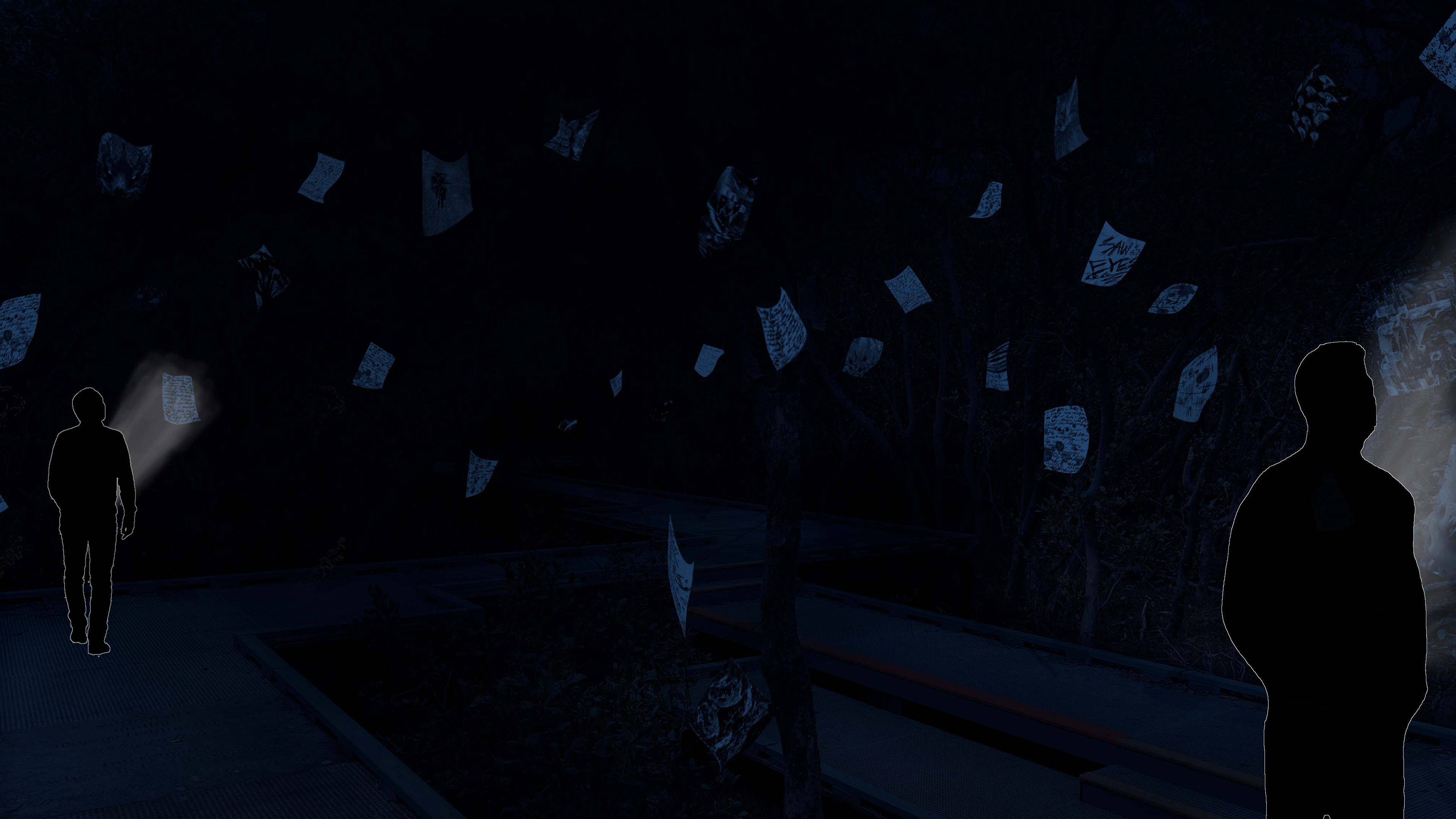
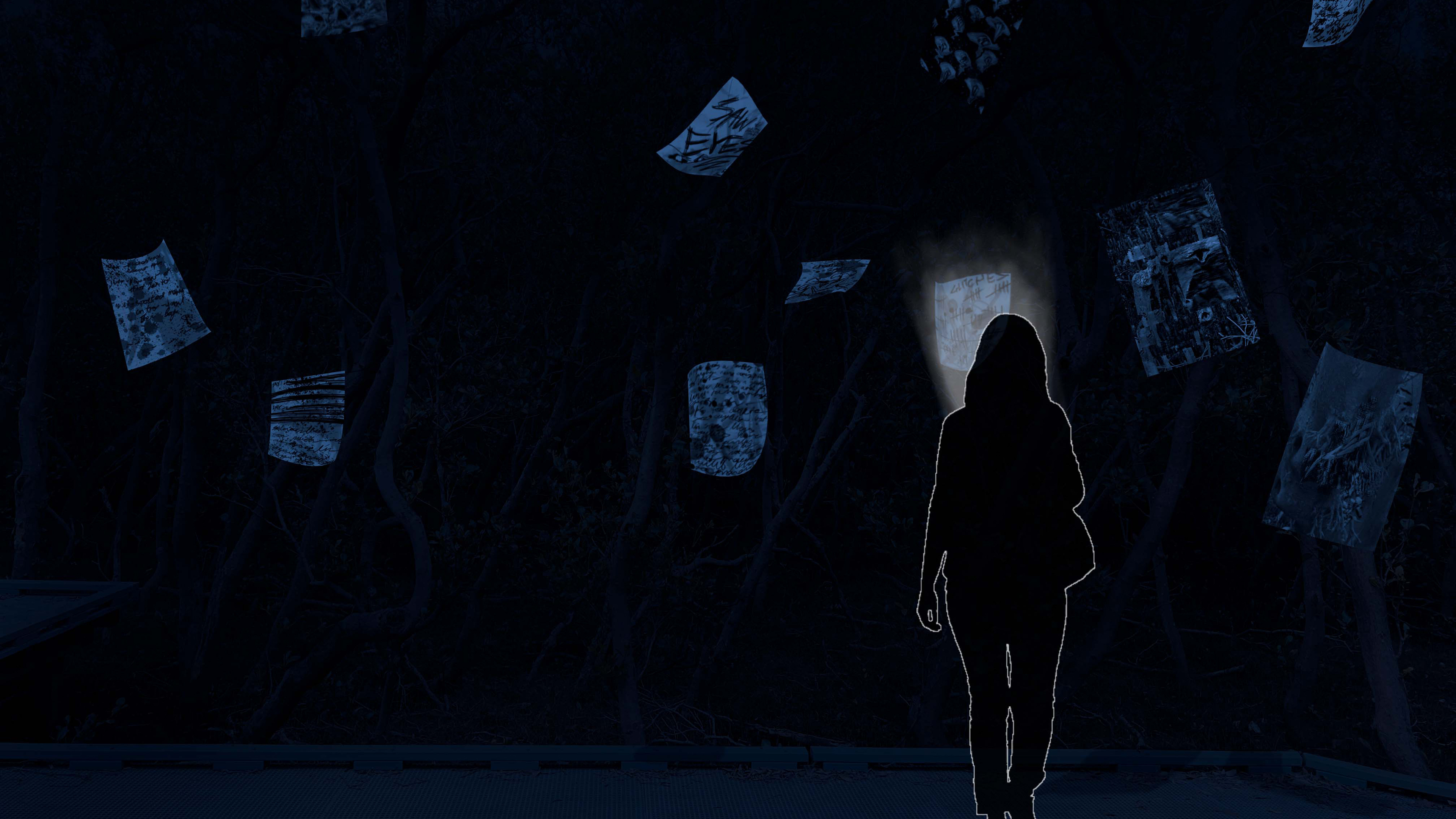
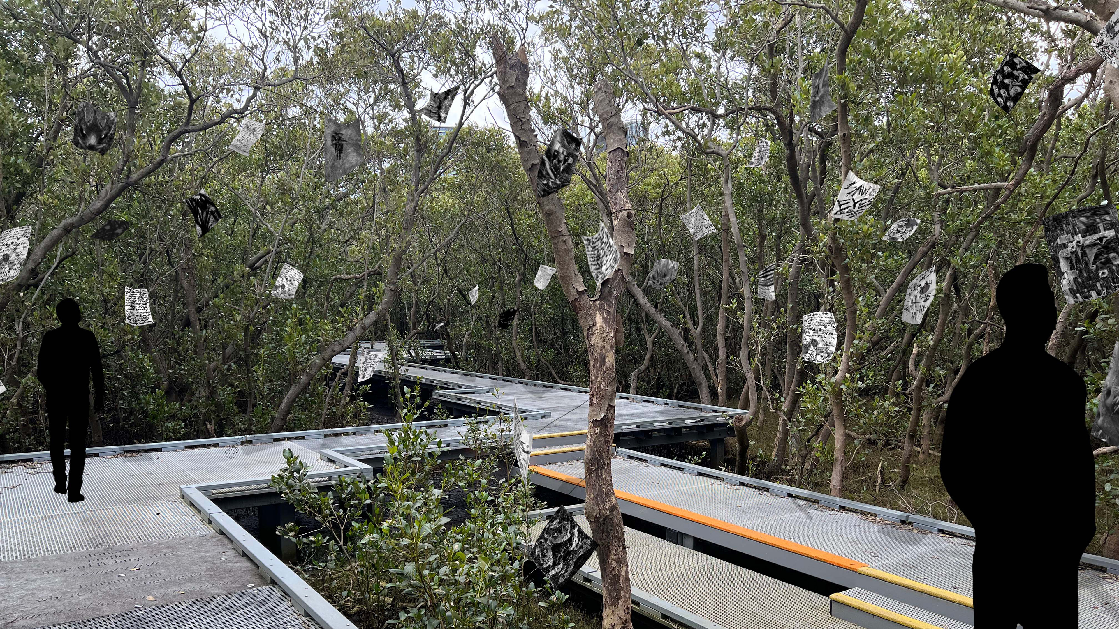
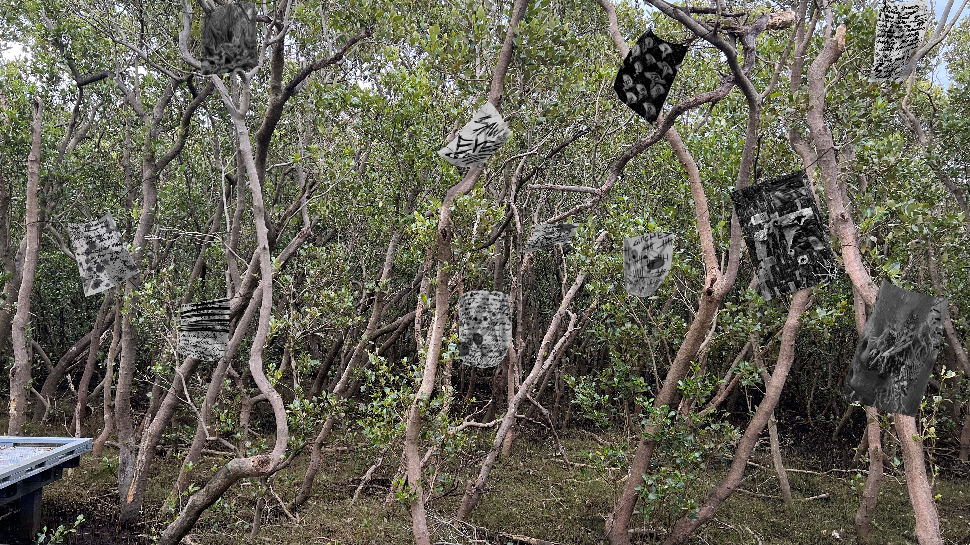
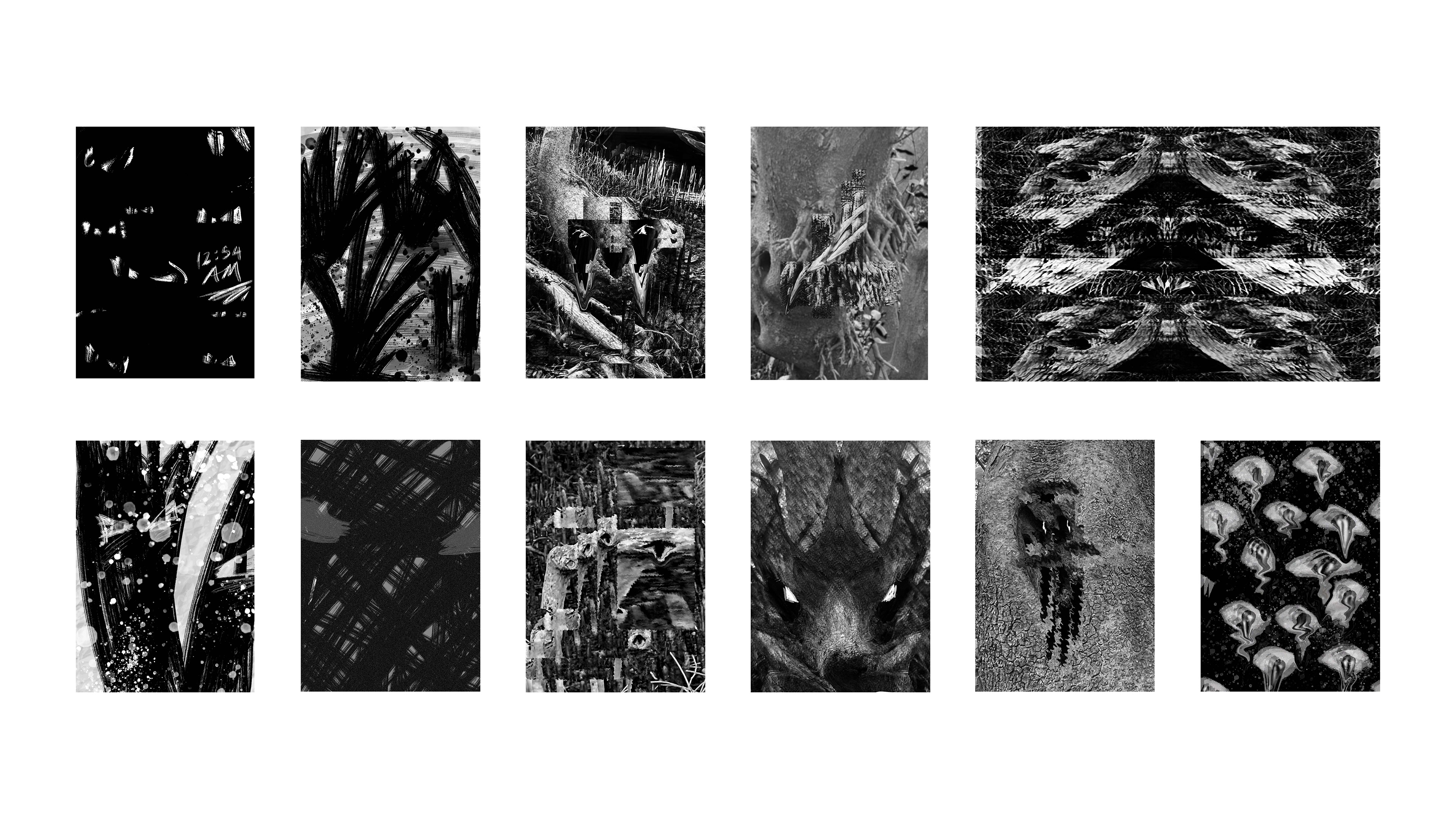
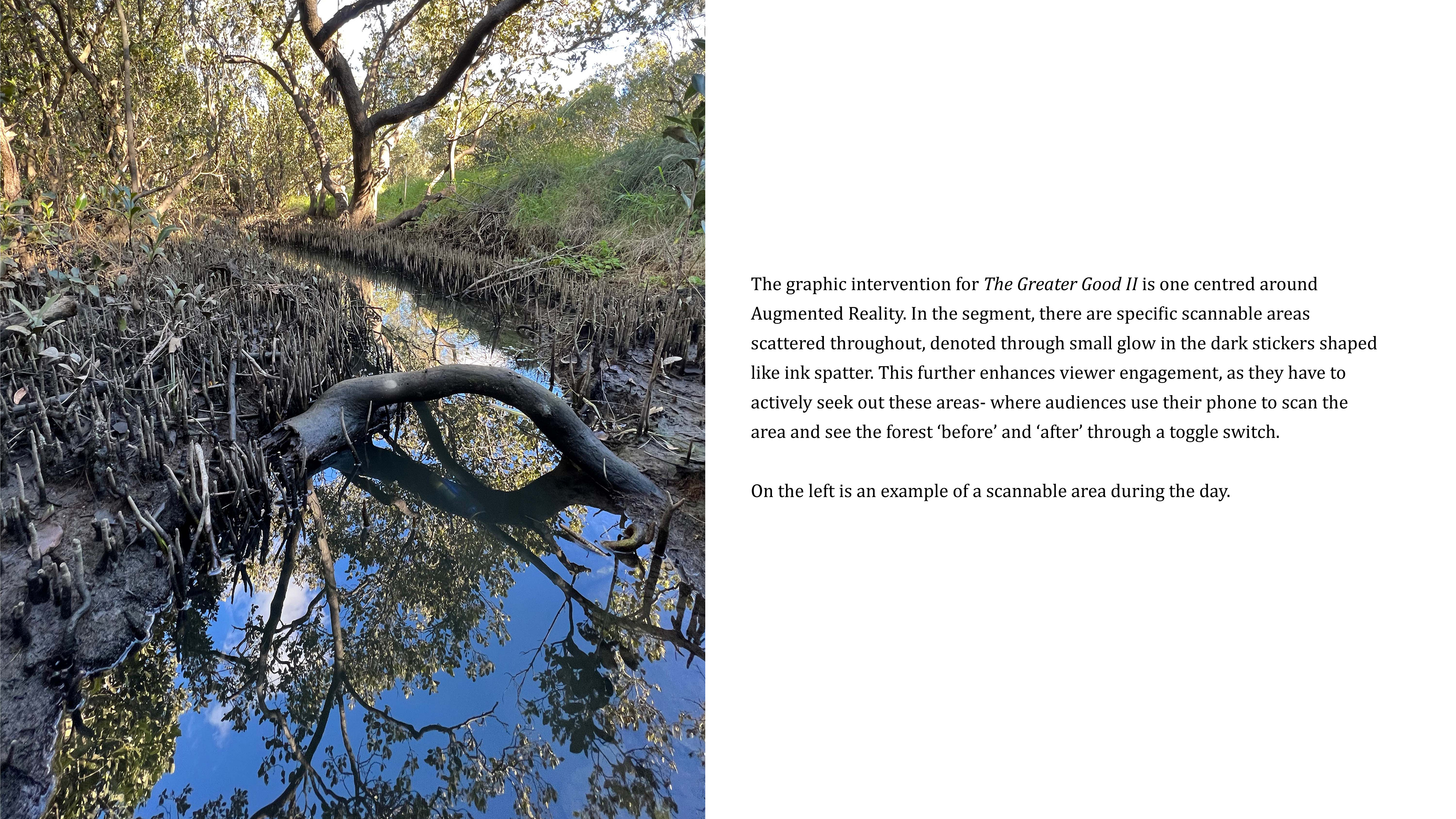
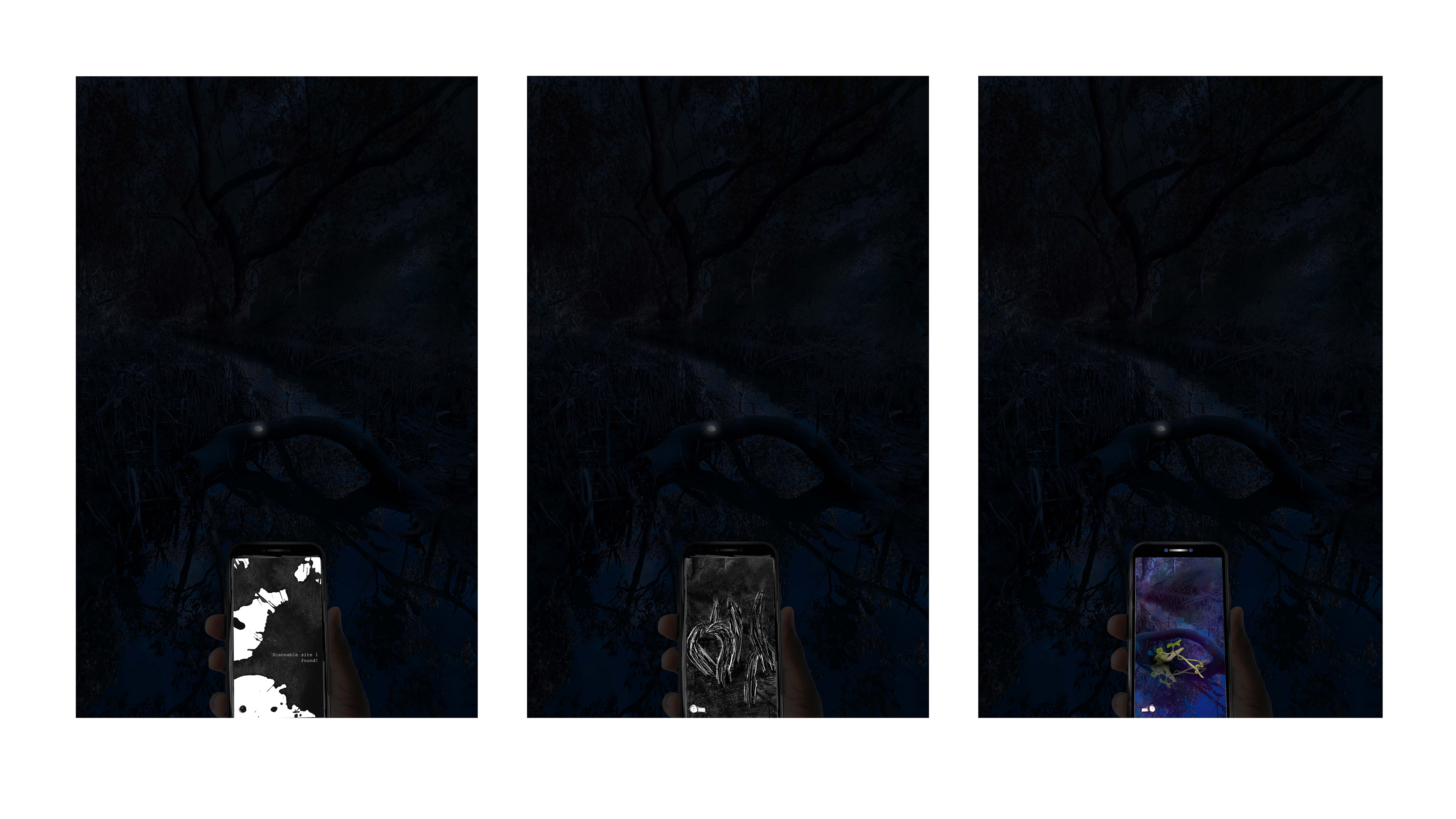
The trail walk has been carefully curated to yield maximum impact: from context specific graphical interventions which are designed for audience participation to the seemingly dubious decision to have minimal lighting. The interventions encapsulate a wide range of mediums to engage the senses, such as mirrors, augmented reality, animation, and photography.
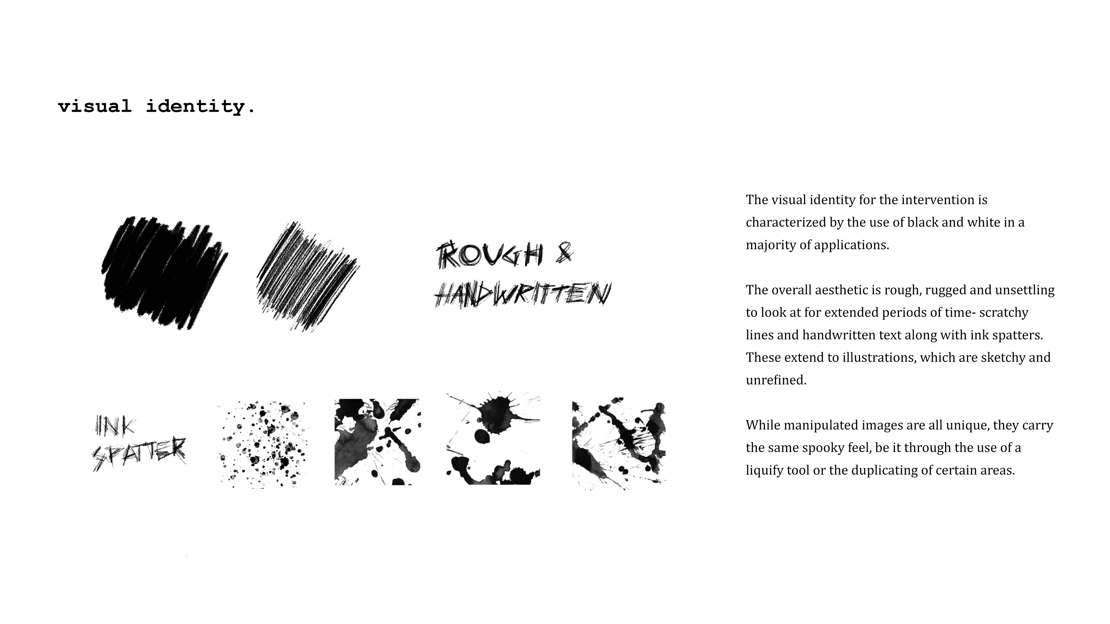
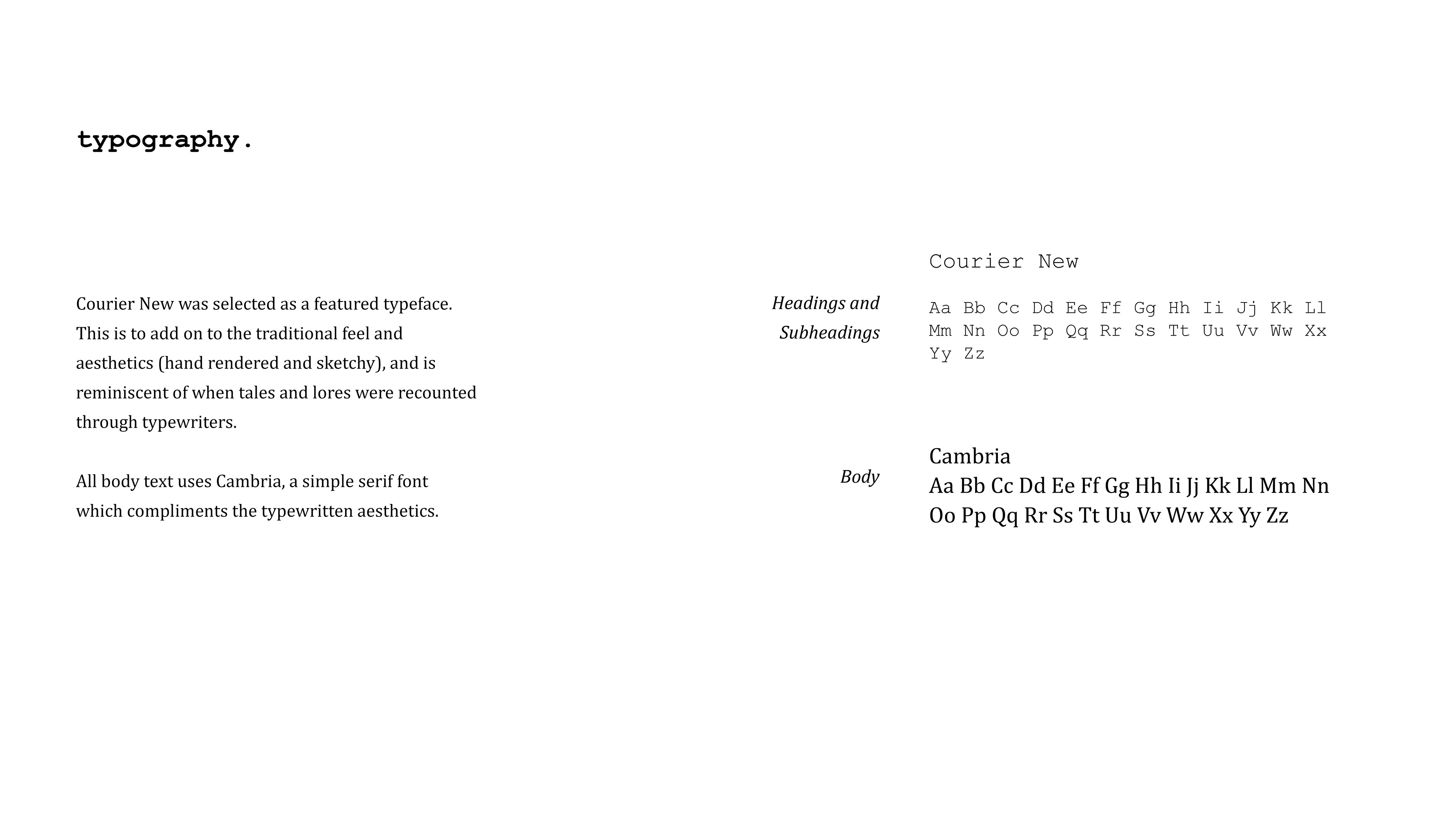
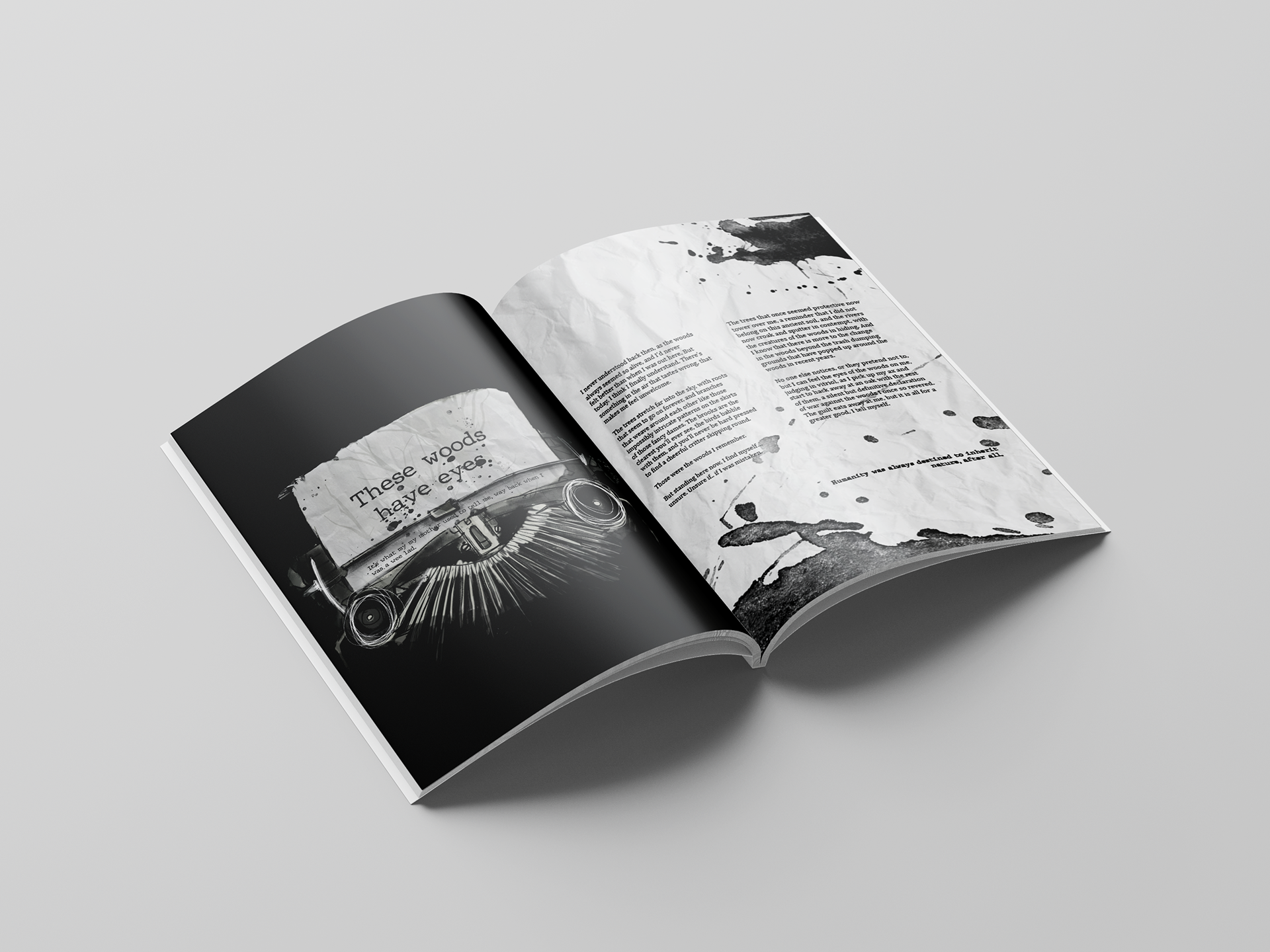
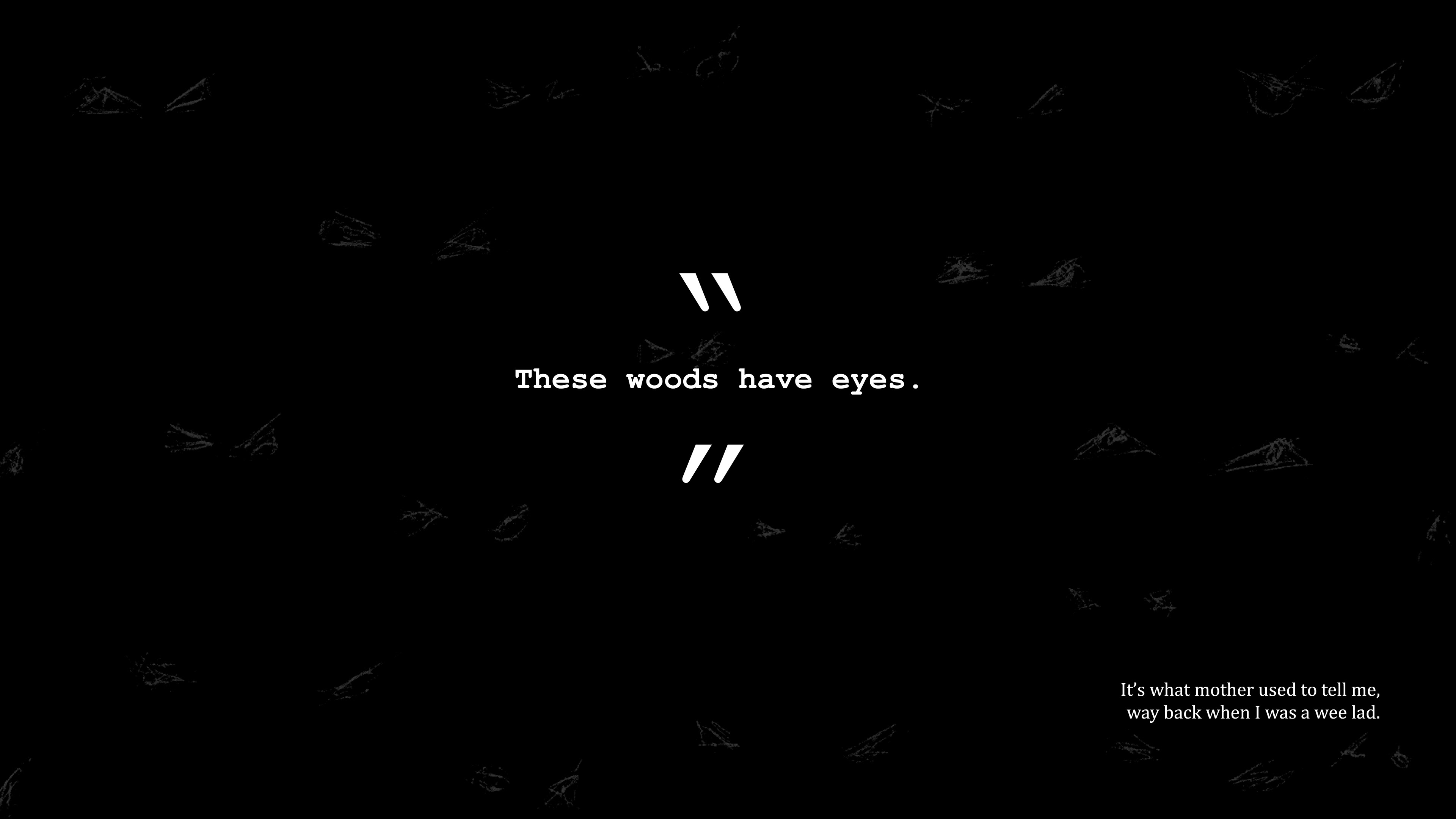
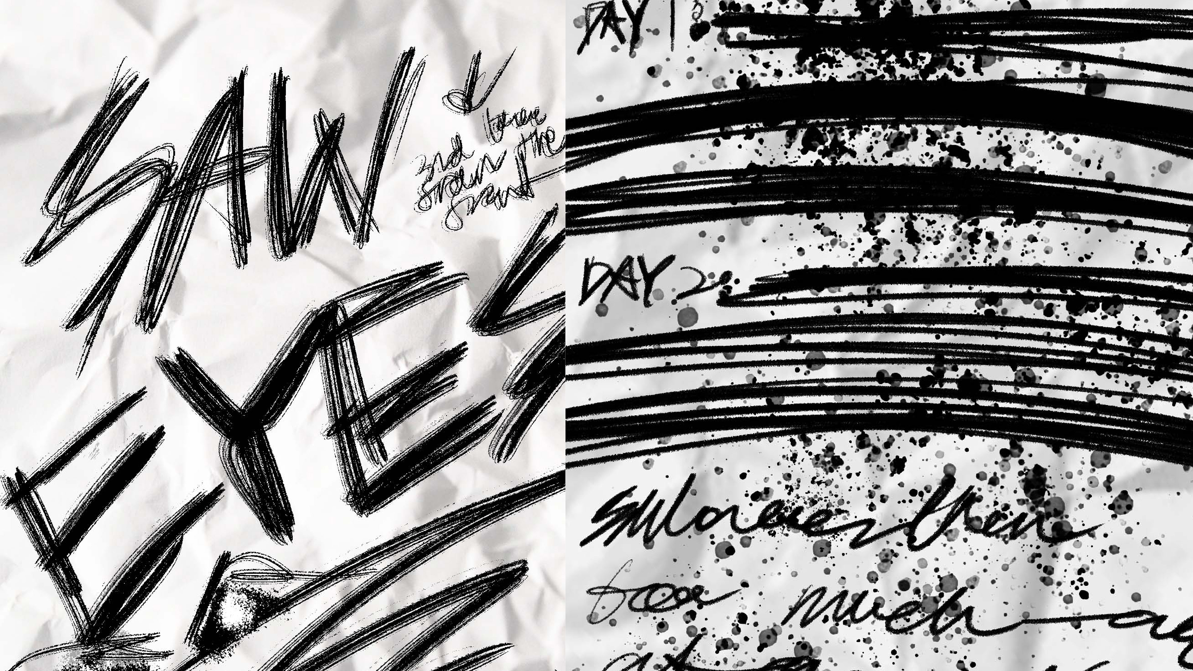
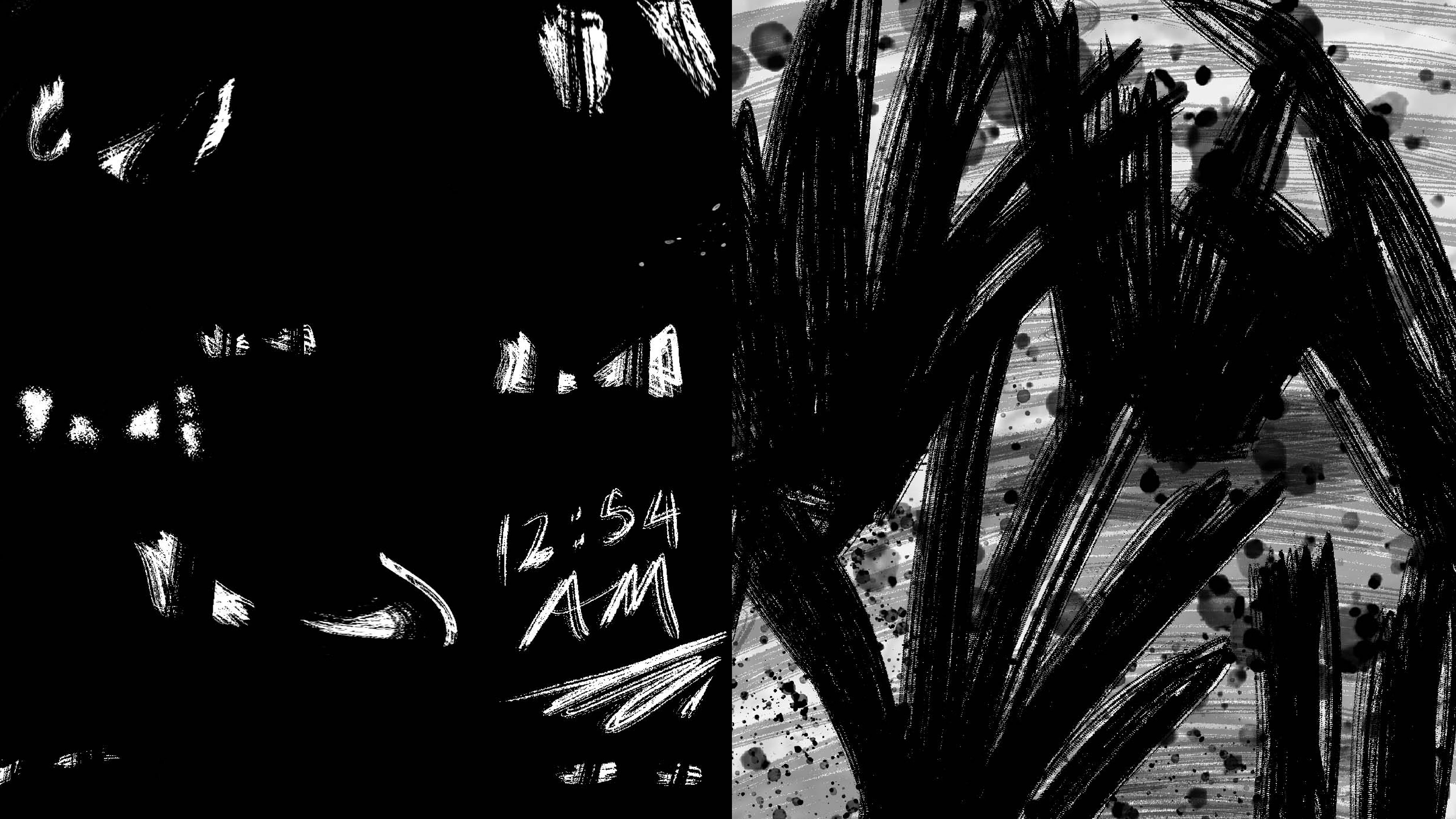
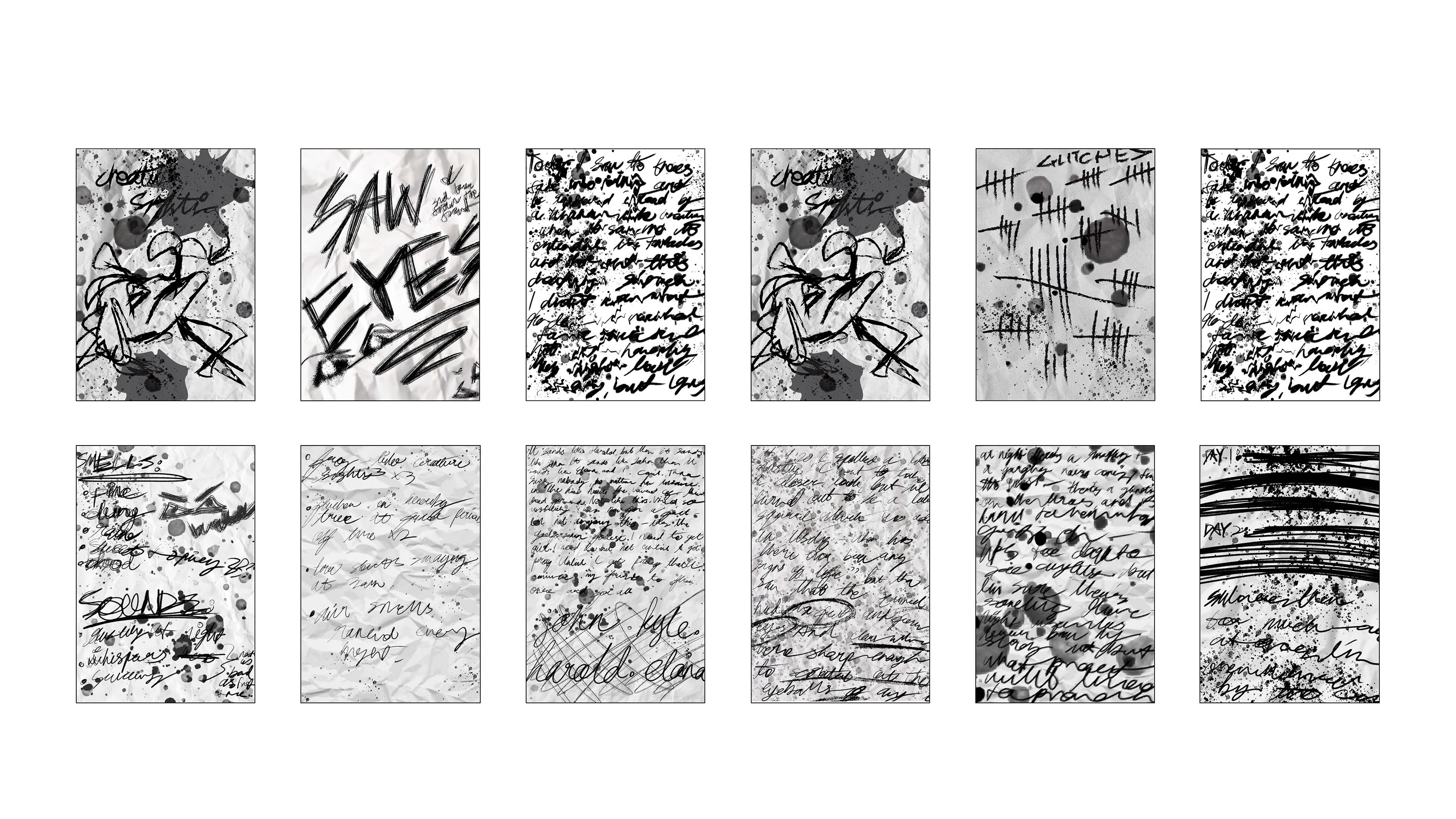
The aesthetics of the trail walk takes inspiration from the traditional means of art, such as sketchy hand rendered text and drawings, flipbook animations and typewriters. This is further evidenced in the typeface selection, where a typewriter-inspired font is utilised in headings, and a simple serif one is used everywhere else, representing tradition and authority (Lavine, P.S.).
The aesthetics of the trail walk takes inspiration from the traditional means of art, such as sketchy hand rendered text and drawings, flipbook animations and typewriters. This is further evidenced in the typeface selection, where a typewriter-inspired font is utilised in headings, and a simple serif one is used everywhere else, representing tradition and authority (Lavine, P.S.).
Drawing on the words of Barnum (2011), who expressed that colour palettes did not necessarily need multiple hues and colour, I chose to use a monochromatic colour palette. The use of black and white as the sole colours (with a singular exception) largely stems from colour psychology. Both colours are associated to opposing things: black symbolises death, the bad and evil and power (Cherry, 2020), while white symbolises purity and innocence (Cherry, 2020). Together, they are often linked to the idea of life and death, good and evil and right and wrong (Sensational Color, n.d.). These themes are central to my graphic intervention, so it only seemed right to use them as the main colours. Additionally, these colours seamlessly fit into the visual identity I had already begun to create.
Research and Visual Identity:
Booklet and Wayfinding:
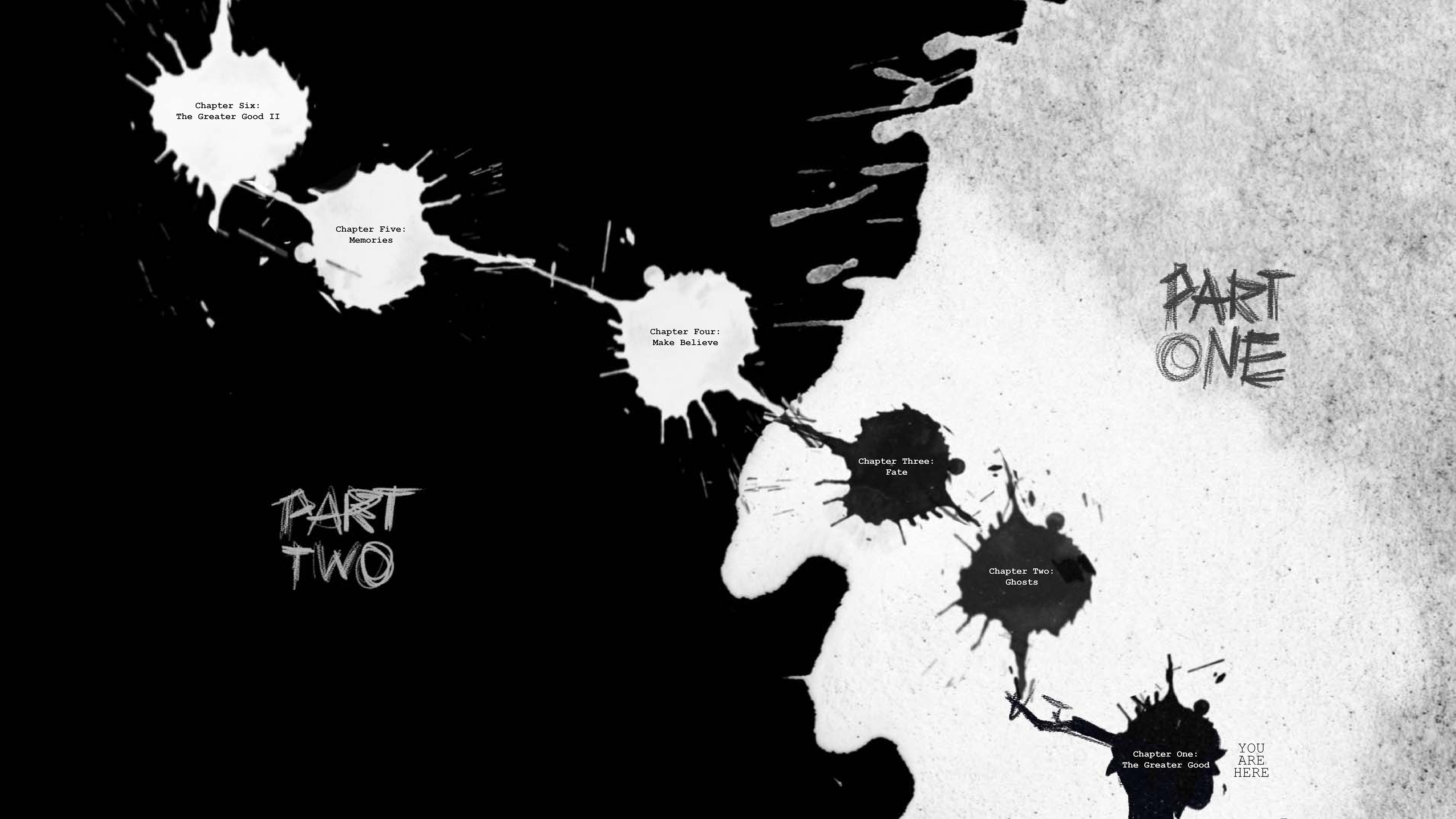
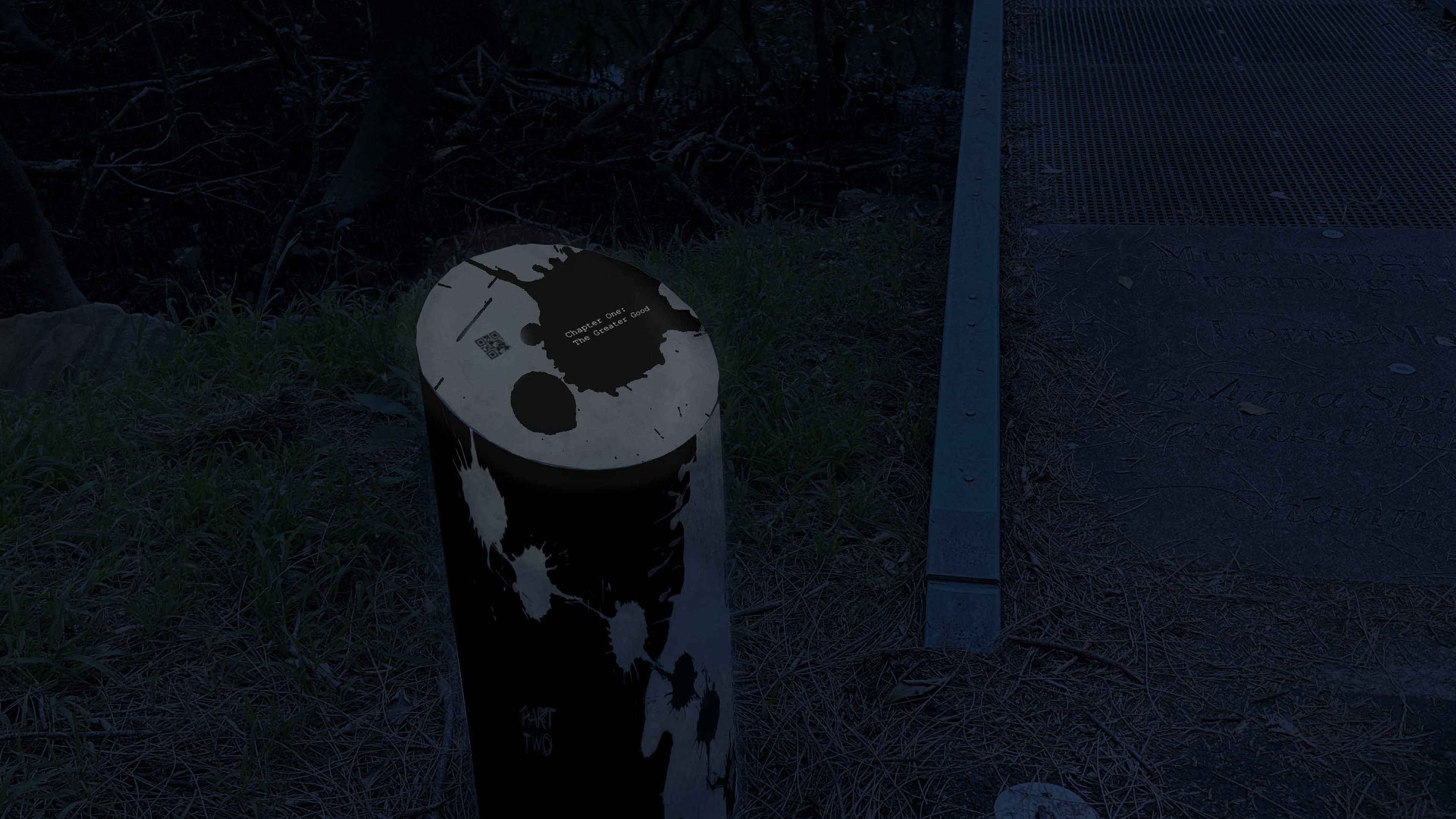
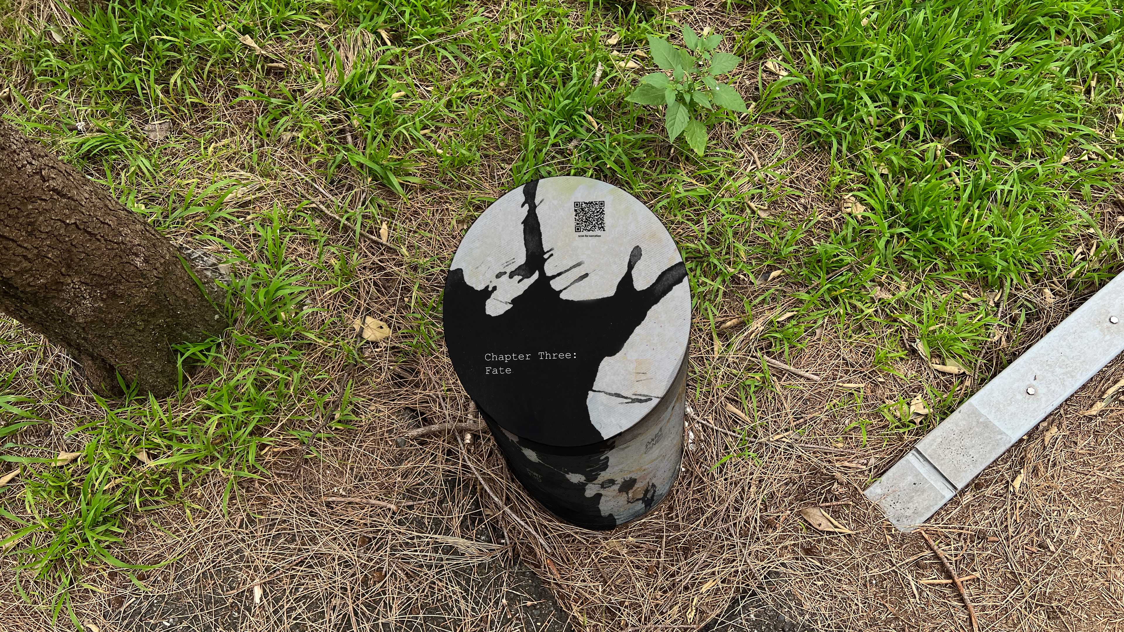
Chapter One: The Greater Good
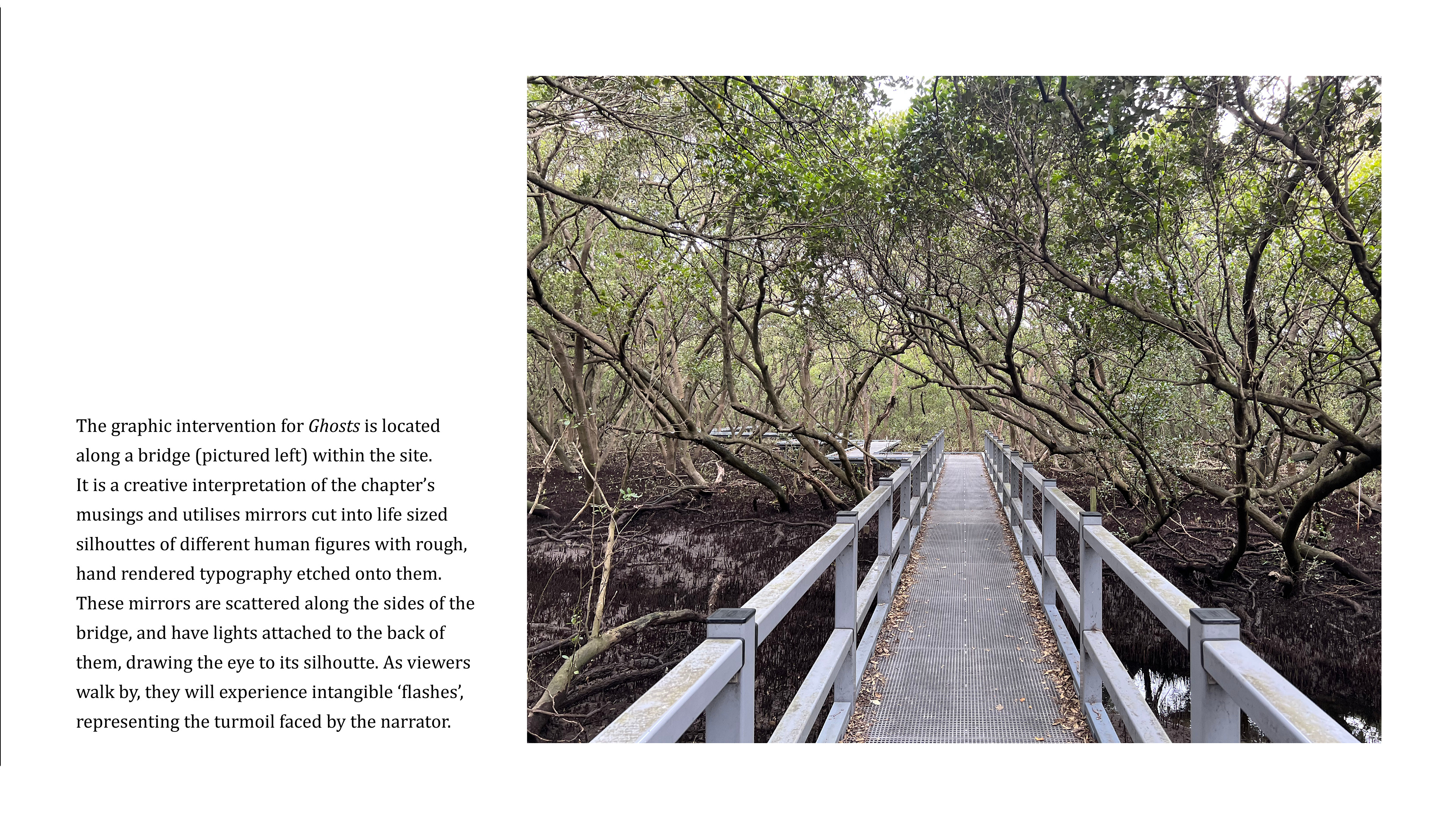
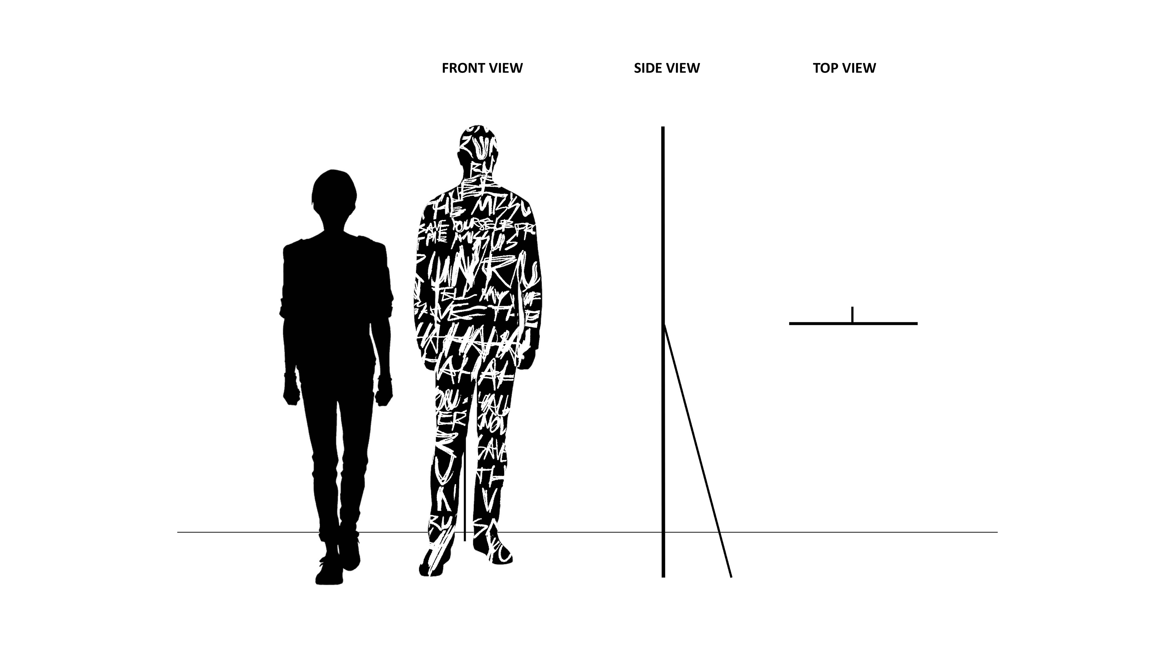
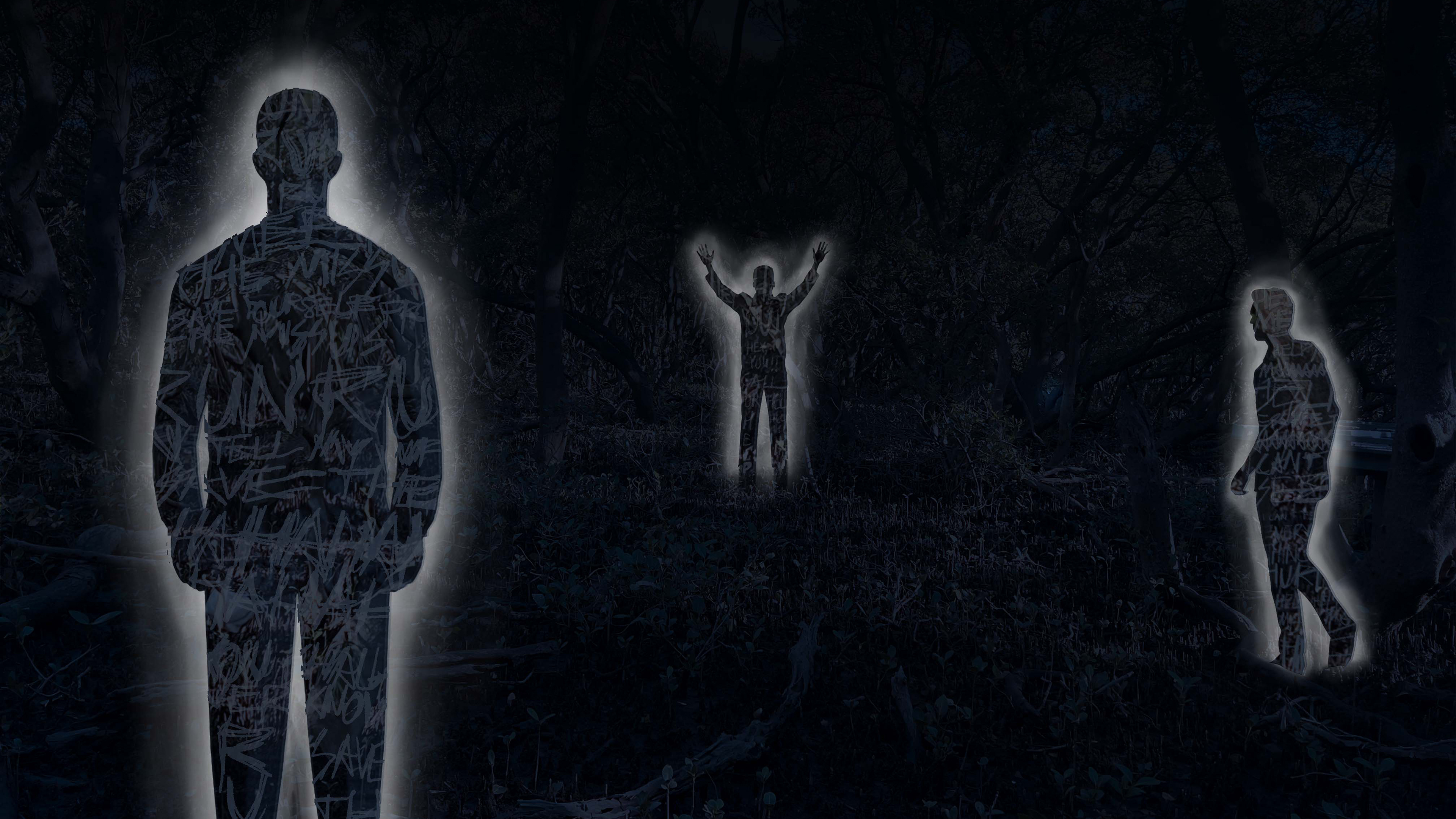
Chapter Two: Ghosts
Chapter Three: Fate
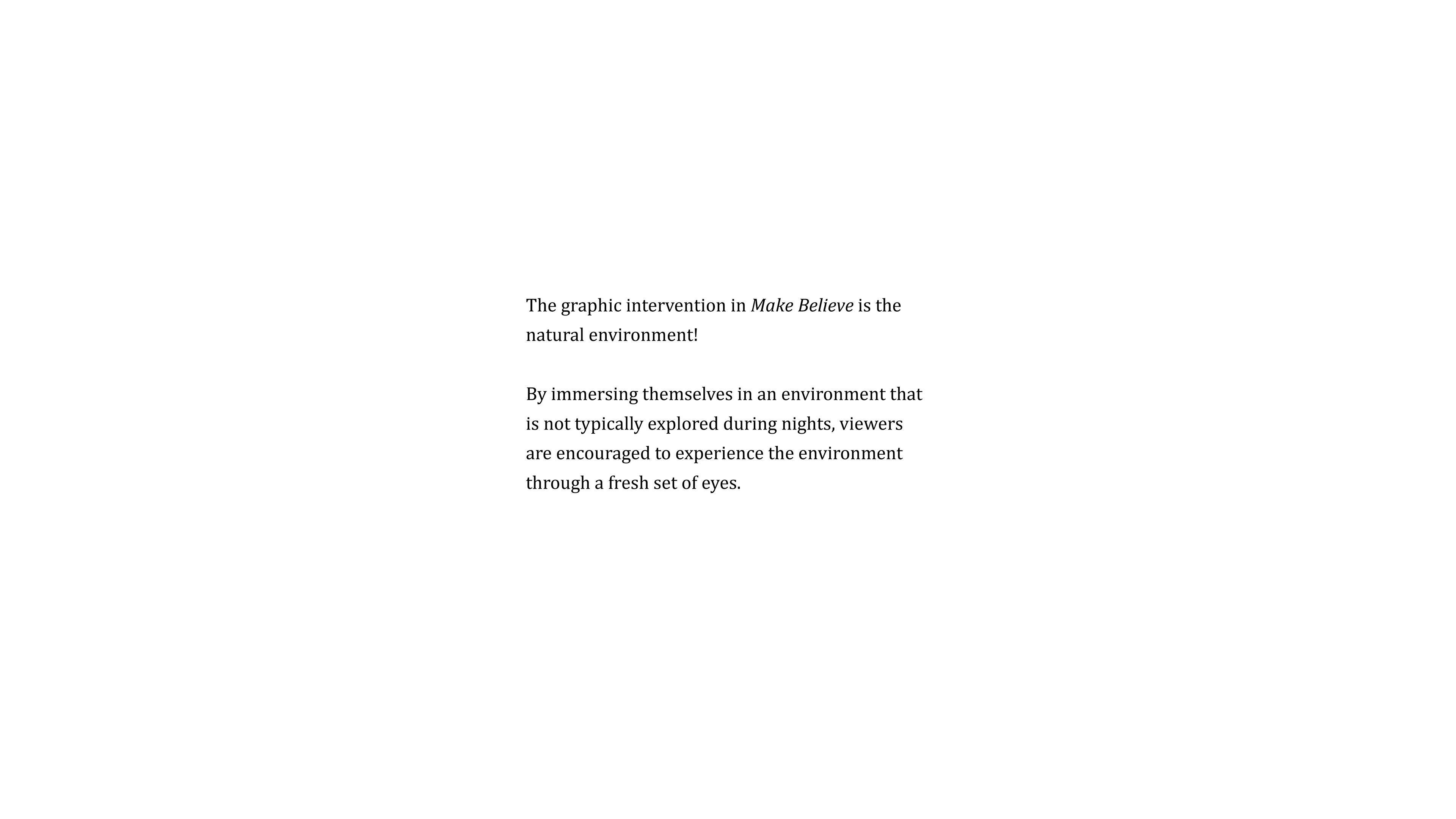
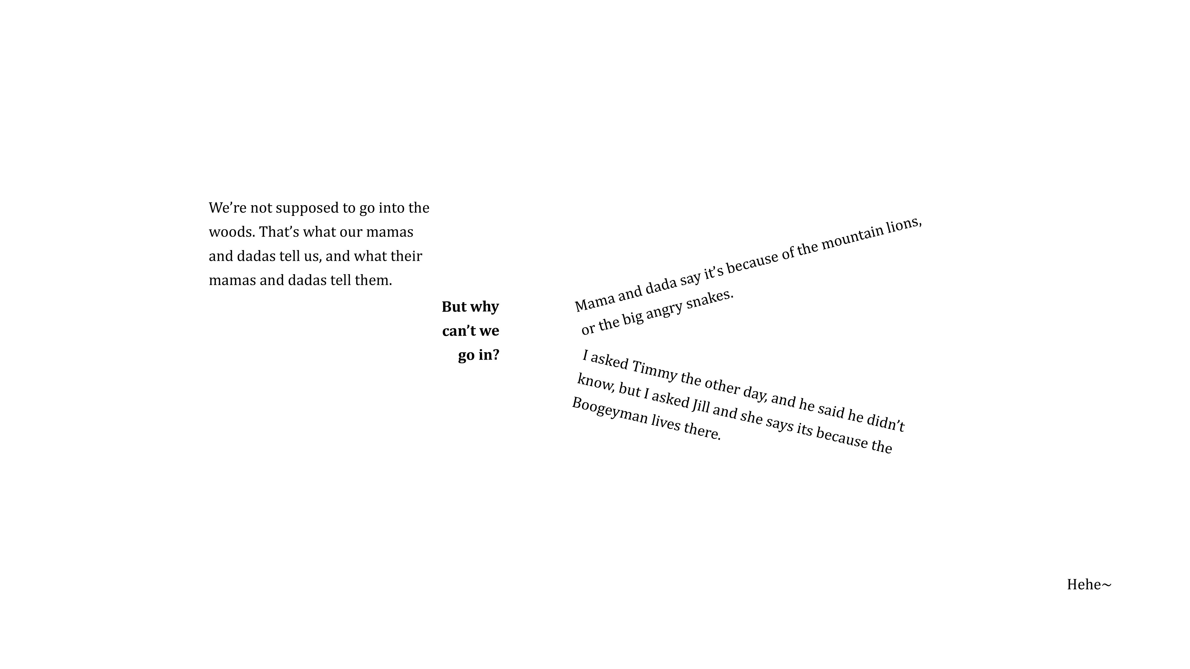
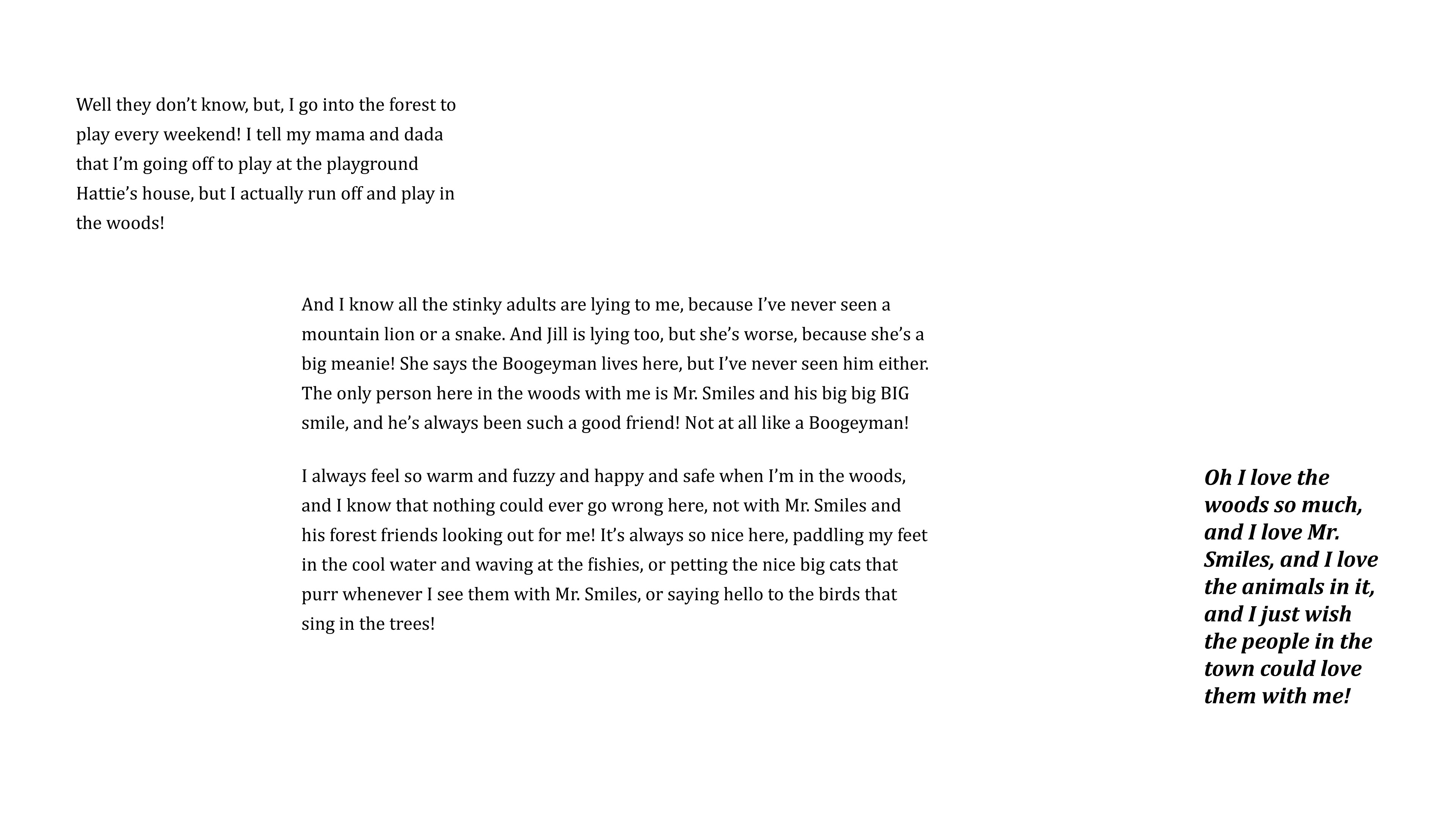
Chapter Four: Make Believe
Chapter Five: Memories
Chapter Six: The Greater Good II
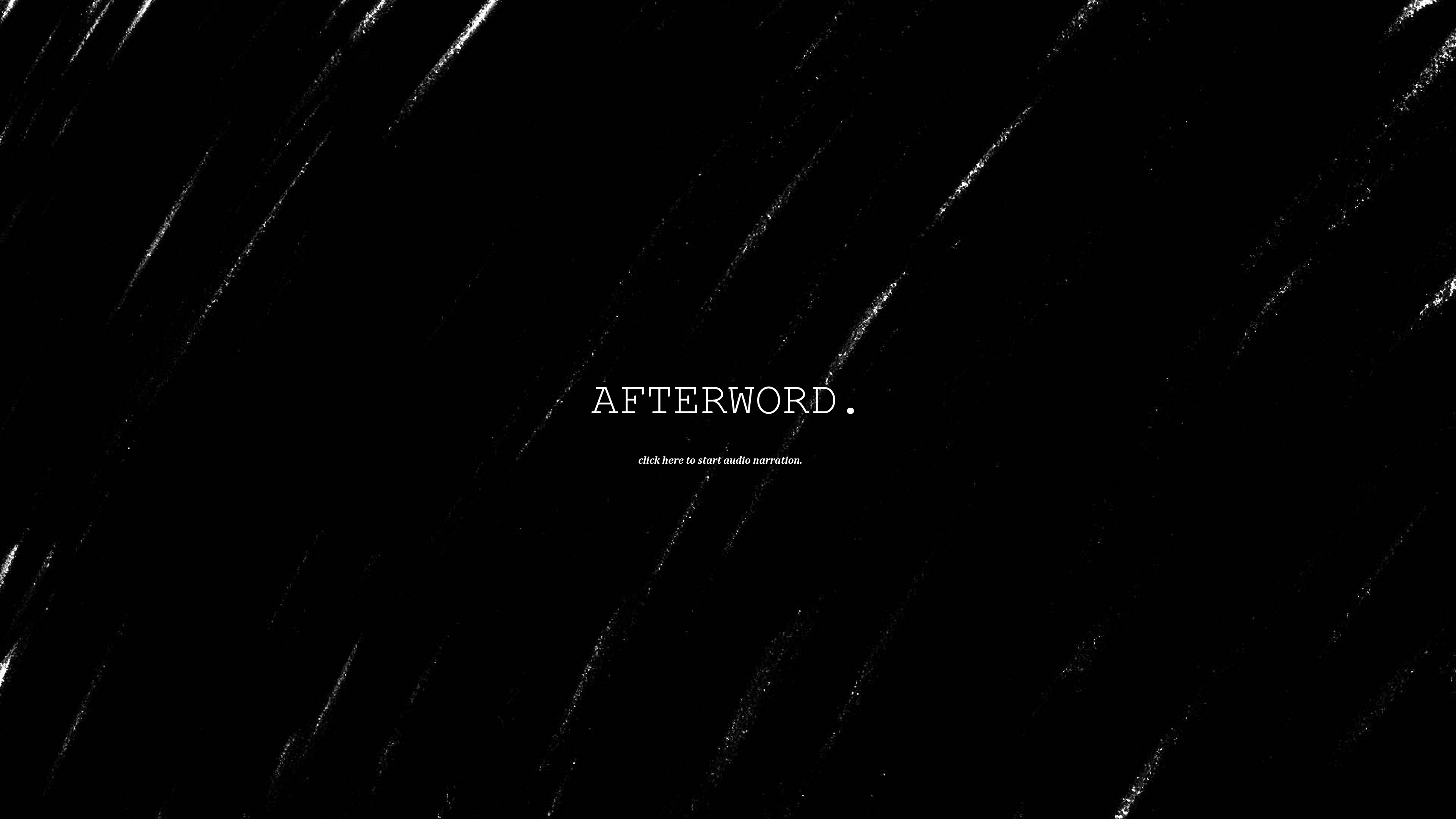
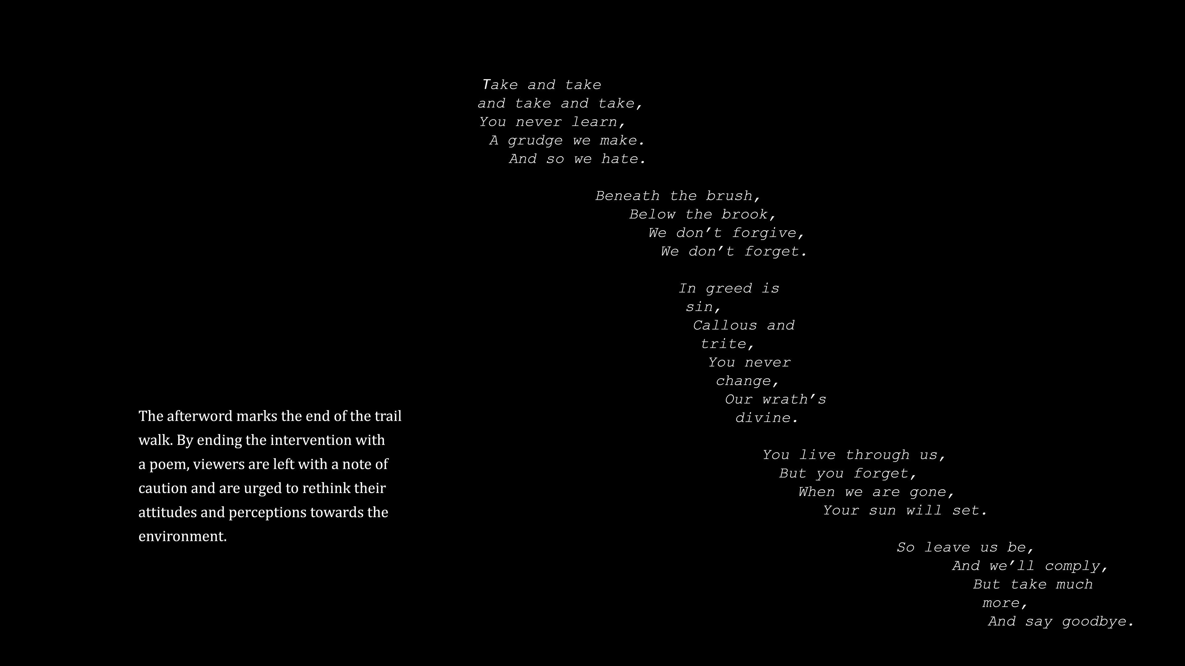
Afterword